Showing posts with label art. Show all posts

Sunday, February 25, 2018

Propaganda posters from the Spanish Civil War #3 : a contrast or a consensus?

(this is the third installment; the first group of propaganda posters from the Spanish Civil War is here and the second, focusing on depictions of Franco, is here)


the Government's leash hand
Izquierda Republicana Junta Municipal Valencia
Gobierno. 
Obediencia ciega hasta ganar la guerra.
Orden Publico
Agricultura
Transporte
Industrias de Guerra
Ejercito
El que trate de mermar dicha autoridad es un traidor y a estos hay que exterminarlos.

Left Republican Municipal Council Valencia.
Government. Obedience blind until winning the war.
Public Order
Agriculture
Transport
War Industries
Army
The one who tries to reduce that authority is a traitor and these must be exterminated.


-----------------

It is surprising how much the Republican side and the Nationalist side agree. The above poster calls for the extermination for those who are not blindly obedient to the government and the poster below agrees : communism leads to extermination


communism leads to extermination : for some it is a bug for some it is a feature
"Lo Que Hay... ...Detrás del comunismo"
What there is ... ....behind Communism


-----------------

(scene : interior of a Valencian poster design office)
Valencian #1 : "Let's portray the government as a giant who can guide people into working together."
Valencian #2 : "Well, we should also stress the consequences of not working together."
Valencian #1 : "Let's portray the government as a giant who is psychopathically violent at anything less than cooperation." 
Valencian #2 : "but what about disagreement or questioning or people making suggestions?"
Valencian #1 : "Okay....Let's make it a giant who is psychopathically violent at anything less than blind obedience."
Valencian #2 : "*sigh* Cold blooded murder is awesome! I want to marry that giant! But shouldn't we portray the purpose of the government?"
Valencian #1 :  "Good thinking! We'll portray the government as a giant who is psychopathically violent at anything less than blind obedience and he keeps people on leashes." 
Valencian #2 : "Who wouldn't admire a government like that"


Thursday, October 26, 2017

Painting in a Painting : John Singer Sargent


Claude Monet, Painting by the Edge of a Wood, 1885 by John Singer Sargent 


detail :
Monet's unfinished canvas in the Sargent painting cropped and distorted into a rectangle. (note the inclusion at the bottom right of Monet's hand, blue shirt and pallette)


Below, to contrast is Monet's finished painting

Meadow with Haystacks near as Près à Giberny, 1885 by Claude Monet

Sunday, October 8, 2017

Propaganda posters from the Spanish Civil War #2 : Franco

(this is the second installment; the first group of propaganda posters from the Spanish Civil War is here)


Franco found here 
by J. Davó (signed at lower left) and printed by the Romero Lithograph (Tenerife, Canary Islands). Excellent use of a limited number of colors.

A smiling Franco, atop a white horse leads 2 columns of supporters. Those on the left carry the red and yellow pre-republic, red and yellow civil ensign Spanish flag (or the royalist flag if a crest is hidden in the fold). The column on the right carries the red and black flag of the Falange. Franco and his horse complete the cross.  "Julio 18, 1936" refers to the date of the beginning of the Spanish Civil War. The rays behind the cross evoke a dawn.

Franco's horse steps on a red snake, a traditional symbol of evil, holding a hammer and sickle in its mouth. The symbols of the hammer and sickle were used by some political parties of the Republican Left.

Not to be cruel, but Franco was not a particularly handsome man and yet here he is drawn in a remarkably flattering way while retaining his likeness. Contrast it to the painting below by Paco Ibera. Franco is as reality would have him : balding, bags under his eyes and a rounded chin (disguising a double chin that can be seen in the photo of Franco later in the page.

----------------
Dictator in Furs by Paco Ibera
This was previously mentioned here. Go to that link for more commentary on this.

----------------

"Franco cut off at the knees" may not have been the creator's intent

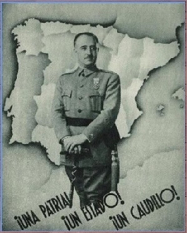
Una Patria! Un Estado! Un Caudillo! (One fatherland! One state! One strongman!)

I suspect this is not from the Spanish Civil War but afterwards.  Cropping Franco off at the knees making him look like Dorf the Dictator. I find it interesting that while there is a relatively bright contrast between the Spanish-French border there is less contrast between the Portugese-Spanish border – it is only slightly more pronounced than the internal borders. Franco presents him self simply : a lack of epaulets or furs or rows of medals.

The font seems very 1930s.

----------------

The next portray Franco is a less flattering way.
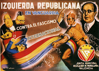
 Izquierda Republicana En Vanguardia Contra El Fascismo Internacional (Left Republican in vanguard against international fascism) by Petit Guillén Carteles  de la Republica y de la Guerra Civil #180
Left Republican in vanguard against international fascism! (Seriously, you would think they would have included an exclamation point or 2)

Izquierda Republicana En Vanguardia Contra El Fascismo Internacional (Left Republican in vanguard against international fascism) by Petit Guillén (signed at lower left)

from the upper left is Jose Maria Gil Robles (with a pear for a head and bald except for a stem on top) he wears a Sacred Heart necklace to note his Catholicism. Next to him is Benito Mussolini wearing a tiny hat. Below Gil Robles is Adolph Hitler looking sad with his head cocked horizontal.
from left to right : Gil Robles (no stem on top), Francisco Franco and unknown.

Below Hitler is a short, cartoony, Chaplinesque Francisco Franco with a swastika and a death's head on his hat and a sword in his raised hand.

They are all wrapped in the Spanish Republican flag (red, yellow and purple) being pulled by a Republican soldier. While Mussolini, Hitler and Gil Robles are bound together, Franco only has the flag wrapped on one side and he holds a sword that can probably cut fabric.

To the right, behind the soldier, and at the far right is Manual Azaña and his awkward, wrongly drawn hand and pointy finger gesturing upwards. Unlike Franco in the first image, I think here Azana looks little better than reality.

photograph of Manual Azaña (note that the artist wasn't exceptionally unflattering it is just that Manual Azaña looked like a muppet in real life.)

Surrounding Azaña is a crosshatch of white.  Part of the problem likely being those on the left (of the poster) were drawn by a skillful cartoonist while Azaña was likely drawn by the cartoonist copying a photograph and trying to draw realistically while his real talents line in his skill as a cartoonist.

At lower right is a logo "Junta Municipal Delegation de Propaganda Valencia" (Municipal Board Delegation of Propaganda Valencia) (as an aside it is a nice font)

A striking contrast in styles; cartoony for the villains and realistic for the politician and idealized for the Republican soldier.

----------------

el generalisimo by Pedero Carteles de la Republica y la Guerra Civil #551
el generalisimo by Pedrero (signed at lower left)

#551 in Carteles de la Republica Y la Guerra Civil
Junta Delegada de Defensa de Madrid

I imagine that  the title "el generalisimo" in all lower case was intended to be diminishing towards someone grandiose enough to call himself "el generalisimo."

Francisco Franco as death himself dressed in a long grey coat, a black and red cape, white gloves, and spurs. His hand on his sword and his cape carried by an obese army general, an obese capitalist and an obese friar toting a rifle. Again, Franco is shown wearing a swastika.

The helmet is more like a Prussian/German pickelhaube than a contemporary Spanish army helmet (at least as far as i've seen. In fact, while I've browsed through many photos from the Spanish Civil War the only helmets I've seen are on the Republican side. The overseas cap seems to have been worn on the Nationalist side.) Franco's white gloves remind me of the white gloves a plethora of animated cartoon characters like Mickey Mouse wear.

----------------

el generalisimo by Antonio Cañavate Carteles de la Republica Y la Guerra Civil #552
el generalisimo by Antonio Cañavate (signed)
I.E. el generalisimo
Junta Delegada de defensa de Madrid
Rivadeneyra, UGT  Madrid

I think this is the most effective. It is fun, interesting and harshly mocking. Francisco Franco on his My Little Pony (with a swastika brand). The chubby horse smiles at a butterfly as it rears up while striking a coy David-esque pose.
Napoleon Crossing the Alps by Jacques Louis David, 1801

Franco's chest is puffed out and he holds a wooden club (one of the knots is heart shaped). He wears an extravagant uniform complete with epaulets, a sash, side stripe pants, a hat with different colored feathers,He has a colorful horse blanket and a blunderbuss (outdated for a 100 years). I'm not sure why his skin is orange, perhaps to comment on his tan from his years in Morocco and the Canaries.

From the swirling clouds drop 2 bombs. The cactus in the background is made up of faces.

It is interesting that the swastika is attached to Franco by his opponents but Franco did not use it as a symbol used to represent the Nationalists. The symbol used by Franco is the old national flag - horizontal red, yellow, red stripes or the red and black Falange symbol and, of course, he used himself as a symbol.

In contrast, elements of the Spanish left also freely adopted the hammer & sickle for themselves (in particular : the PCE, Partido Comunista de Espana aka the Spanish Communist Party and PSU the Partido Socialista Unificado aka Unified Socialst Party and POUM Partido Obrero de Unificación Marxista aka the Worker's Party of Unified Marxists).

Keep in mind that at the time of the Spanish Civil War the Nazis were thugs and totalitarians but not yet genocidal mass murderers while the Soviet Union were also totalitarians and thugs but had also been responsible for the death of thousands of forced laborers constructing the White Sea Canal,  the Holodomor, a man-made famine killed millions, and Stalin's Great Purge had started. Different standards for different totalitarians I suppose.

Note the stark contrast in the message being sent : This poster and the "Izquerida Republicana" present Franco as a joke. A puffed up cartoon dandy. But the one between them shows Franco as a gigantic walking death.

Saturday, April 8, 2017

Art as a Creative Endeavor : Andy Warhol's Prince

Seen here


photograph of Prince, 1981 by Lynn Goldsmith
(I couldn't find a clean copy of the photo –this one is close –so this is taken from the lawsuit against the photographer by the Andy Warhol Foundation hence the oval around the eyes)


Prince by Andy Warhol, 1984

animated gif below the fold

Tuesday, November 29, 2016

Art as a Creative Endeavor : Norman Rockwell vs Michelangelo

Not plagiarism, exactly, but more of an homage.


Sistine Chapel, Prophet Isaiah by Michelangelo, circa 1542-1545

Rosie the Riveter by Norman Rockwell, 1943
Note that Norman Rockwell's picture includes a halo.

an animated gif comparing them below the fold.

Wednesday, November 16, 2016

Art as a Creative Endeavor : Caravaggio vs Rubens

The Entombment of Christ by Caravaggio, 1602-04

The Entombment of Christ by Peter Paul Rubens, 1612-1614

Peter Paul Rubens painted the altarpiece for the same church, Santa Maria in Vallicella in Rome, that hired Caravaggio to produce the chapel painting "The Entombment of Christ." He must have seen Caravaggio's work and been impressed. Or he thought he could improve it.

Interesting how faithful Rubens copies parts of Caravaggio's work but he also dramatically changes the composition. The man at the left in red (John the Evangelist) is moved significantly in pose and in position although his hand remains positioned on Christ's wound. The head of Christ is changed, as is the head of Nicodemus, holding Christ's legs. The hair of both have changed. The Italian Caravaggio had given them black hair while the Flemish Rubens gave them lighter hair I would guess to make it more relatable to the local audience or more relatable to himself. The color of Nicodemus' clothes is also changed.

The stone slab is more unfinished and painterly in Rubens' version. Rubens omits the plant at lower left.

Rubens also omits the woman with her arms upraised (Mary of Cleophas) probably because when people look at Caravaggio's version they connect her with the stout man legs below her belonging to Nicodemus. Mary Magdalene with her hand to her head and her head down is modified only slightly. The older woman would be the Virgin Mary which Rubens changed radically and added another woman beside her. Personally I like Caravaggio's Virgin Mary and Mary Magdalene in parallel next to each other with their heads bowed down together like a visual stutter.

Rubens painted several variations of the subject, perhaps the subject for future post.

As a bonus, Caravaggio's entombment of Christ as drawn by Paul Cezanne
The Entombment of Christ by Paul Cezanne

An attempt to show the scale of the paintings. The Caravaggio appears larger than life size.

below the fold is an animated gif comparing them

Friday, November 11, 2016

Art as a Creative Endeavor : Adolf Hitler

The pictures of Adolf Hitler's watercolor paintings are from the TV show "Bright Lights, Brilliant Minds : A Tale of 3 Cities" (2014) Season 1 Episode 1 "Vienna 1908" from BBC Four. The show covers three cities at particular times and their creative output.

First let me mention how annoying this presenter is. Dr. James Fox (not to be confused with the black Jamie Foxx)  is a total ham and makes a variety of assertions which he states with confidence but usually doesn't back them up.

Adolf Hitler spent 1905 to 1913 in Vienna, Austria as an aspiring artist. Below are the 3 examples of Hitler's work shown. I suggest that one of them might have been drawn from a photograph and that the other two were almost certainly drawn using a photographic reference.

St Charles Church (Karlskirche), Vienna watercolor by Adolf Hitler

The two columns are not parallel and they aren't the same height. The columns lean away from one another. The perspective of the capital at the top of the columns looks about correct but the top of the column on the left was drawn too high so it doesn't quite look right. When drawing from a photo sometimes the focus on copying means you miss the position of the details within the whole.


Austrian Parliament (Österreichisches Parlament) building watercolor by Adolph Hitler
in the background at center left is the Votivekirche church spires and to the right is the Burgtheater.

The first thing is the bird's eye perspective. It is possible that he went across the street from the parliament and drew it from the 3rd or 4th floor of the building across the street but it is doubtful.

This picture postcard of the Austrian Parliament and the drawing are very, very similar.  

photograph of the Austrian Parliament dated 1906

Now just because the perspective is the same doesn't mean he copied it from the photo. He could have coincidentally chosen the same viewpoint as the photographer. It could just be a coincidence that he included nothing outside of the boundaries of the photograph. He may have even chosen essentially the same composition. But would he have coincidentally included pedestrians (and a streetcar) in nearly the exact same places as in the photograph? 


But the third shown is the coup de grâce.
Vienna National Theater watercolor by Adolph Hitler
The presenter says about this :
"It's not hard to see why Hitler didn't get in [to the Vienna art school]. When you compare him with his contemporaries his quaint pictures of Vienna's historic landmarks seem embarrassingly old fashioned. This is a typical watercolor by Adolph Hitler. I'm slightly pained to admit that its not that bad. There is plenty of precise architectural detail, there is some evidence of perspective and actually his handling of the paint brush is quite confident. But you know what I find so interesting about it? This building, the National Theater, didn't even exist. In fact it had been demolished 20 years before Hitler even arrived in Vienna. But that's because Hitler was painting Vienna a hundred years out of date. A harmonious and eternal Vienna, the city that would never die."

This is what I mean by him making assertions and then failing to back them up. Did Hitler draw the building because it was an essential element of eternal Vienna or what I think is far more likely : he drew the building because that is what his reference photo showed. And if it had been demolished years before he arrived in Vienna how would he know it was part of eternal Vienna and how could he have included precise architectural detail of a building he had never seen.

If you didn't dislike Hitler before you should now that I've shown he was a cheater; a mere copyist and tinter of photographs taken by other people.

Sunday, November 6, 2016

Art as a Creative Endeavor : Edward Burne-Jones

Phyllis and Demophoon by Edward Burne-Jones, 1870
watercolor on paper,  93.8 x 47.5 cm (36.9 x 18.7 in)

The Tree of Forgiveness by Edward Burne-Jones, 1882
oil on canvas, 190.5 × 106.7 cm (75 × 42 in)

In 1870, Edward Burne-Jones exhibited Phyllis and Demophoon
Phyllis, Queen of Thrace, falls in love with Demophoon, son of Theseus. He departs but promises to return in six months' time. When he fails to keep his promise, Phyllis hangs herself, and is turned by the gods into an almond tree. On his eventual return, Demophoon remorsefully embraces the tree, which blooms, as Phyllis emerges to forgive and reclaim her faithless lover.
Both Phyllis and Demophoon are modelled on Maria Zambaco, with whom Burne-Jones had been having an affair since June 1868 (a host of studies exist for both figures, in various locales). And for this reason, in conjunction with Demophoon's nudity, a controversy ensued when it was exhibited at the Old Watercolour Society for the Summer Exhibition of 1870. Within two weeks of the exhibition's opening, Burne-Jones withdrew the painting due to complaints, and two works by other artists were exhibited in its place. In August 1870, Burne-Jones resigned from the Society, over artistic integrity.
In the catalogue for the Summer Exhibition at the Old Watercolour Society, Burne-Jones included the following caption, a quote from Ovid: 'Dic mihi quid feci? Nisi non sapienter amavi' [Tell me what I have done? I loved unwisely.] Burne-Jones later reworked the painting entirely in oils, transforming the bodies of both Phyllis and Demophoon into an homage to Michelangelo, calling it 'The Tree of Forgiveness' (1882, Lady Lever Art Gallery, Port Sunlight), where Zambaco's face remains only on Phyllis.

The Tree of Forgiveness, 12 years later,  is about life sized. The figures are not identical to the previous version but they are remarkably similar and the concept is the identical. The colors are different. in the 1870 painting Demophoon looks slight and ashen.

The drapery in Phyllis and Demophoon covered Phyllis' body along with her arm covering her breast and the magical drapery wrapped itself around Demophoon's leg without providing him any modesty (modesty in the sense of avoiding impropriety or indecency but modest in the sense of "a small amount" could be used to describe him). In contrast, in The Tree of Forgiveness magical drapery covers his manhood and flowingly wraps around his leg and only his leg while she is exposed fully nude.

It is interesting that Michelangelo depicted women by drawing men and the "feminizing" them and Burne-Jones in Phyllis and Demophoon drew a woman and then "masculinized" the figure.


An attempt to show the scale of the pictures.

below the fold is an animated gif contrasting the two.

Saturday, July 4, 2015

Art as a Creative Endeavor : EJ Sullivan vs Stanley Mouse & the Grateful Dead


Edmund J. Sullivan illustration to the Rubaiyat of Omar Khayyam (1913) vs Stanley Mouse's Grateful Dead poster (1966)
Edmund J. Sullivan illustration to the Rubaiyat of Omar Khayyam (1913)
Stanley Mouse's Grateful Dead poster (1966)


Grateful Dead 1971 double album with cover opened


In 1966 Kelley and I were in the San Francisco public library looking for inspiration for a poster we were doing for the Grateful Dead. We stumbled upon an illustration in the Rubaiyat of Omar Khayyam, a twelfth-century Arabian work of poetry. Kelley said, “ Is that the Grateful Dead or is that the Grateful Dead!?” I responded, “that’s got Grateful Dead written all over it!”
Maybe everyone else knew about this but I had assumed they did more than just make a photocopy of someone else's illustration, add a frame, lettering and color (the poster) or take the photocopy add a art nouveau frame, lettering and color (the album)

Saturday, May 23, 2015

Possibly the Best Coat of Arms in the World


I would like to nominate as the best coat of arms in the world : Hensbroek

Hensbroek is a village in North Holland, Netherlands. "Hens" is dutch for chicken and "broek" is dutch for pants so obviously the coat of arms is a picture of a hen in pants.


from wiki (where they seem less sure as to what chickens look like.)


Hensbroek means hen's pants so why not draw a hen wearing pants?  Actually, it turns out that it's origins are "It was founded as "Heynsbroec", meaning the marshy wetland of Heyn"

An explanation in Dutch is here. I think it means that it was a swampy, marshy land where a person would not want to wear long trousers but instead wear pants (in the British sense or short pants). So, meaning "land-where-you-need-to-wear-short-pants of Hen" Presumably, the coat of arms was drawn without the historical memory of the original meaning.


------------------------

To the people of the village of De Hulk in the Netherlands I offer a coat of arms of their own. I hope they won't be too modest and start calling themselves incredible.

Incredible Hulk coat of arms of De Hulk, North Holland,  Netherlands
De Hulk, Netherlands Coat of Arms


Friday, May 15, 2015

Some people are bad at math with other people's money


Currency by Denis Beaubois, 2011
(aka $20,000 AUD cash)


Denis Beaubois received a $20,000 grant from the Australia Council for the Arts. According to the Australia Council for the Arts the "decision date" was July 5, 2010 but it wasn't exhibited until Aug 18-30, 2011 and his "work" was auctioned off Aug 31, 2011. Assuming the government sends its checks promptly, he could have collected interest on the $20,000 for over a year. 

He took the $20,000 AUD in 100 dollar bills and declared the pile of 2 bundles of money to be art. He titled it the creative name "Currency." It was then auctioned off with a high bid of $17,500 AUD but with the buyer's premium the total was $21,350 AUD. I suspect the high bidder may have gotten carried away or hadn't known the correct percentage charged for the buyer's premium. 

Some of you might notice that $17,500 is noticeably less than $20,000 while some art majors might not. Spending $20,000 to get a return of $17,500 does not seem like the best business plan. It seems Australian arts funding isn't focused on efficiency. But don't worry, he wasn't spending his own hard earned money.

(note some of the pdf links I had found no longer work since I originally wrote this post and were removed and I can't find the replacements. This is not necessarily a complete list. A searchable database is here)
in 1995-1996 he received $8,200 for a "hybrid art project"
in 1997 he received $6,200 for Presentation and Promotion to "O'seas"
in 1998-99 he received $8,045 for Presentation and Promotion to Germany and the Netherlands
in 1999-2000 he received $5,694 for "new work"
in 2000-2001 he received $8,930 for promotion in the USA
in 2001-2002 he received $8,000 for "Part-time residency at UNSW to work with forensic psychologists"
in 2005-2006 he received $20,000 for "new work"
in 2007 he received $20,000 to "Create new video works ‘video for living room’"
in 2010/11 $20,000 to be sold as a pile of cash.
in 2012 he received $20,000 to "Research theories of Capitalism and the Banking system to produce a series of new artworks"

I wonder what percent of grant recipients have previously received a grant?


You'd think the Council would require the grant recipients to send a photo of their work into the council website so people (ie the people paying for it) could see what they've been up to. Imagine a series of photos of Denis Beaubois sitting in a chair between July 5, 2010 and August, 2011 thinking and planning and practicing (counting and stacking bills) and learning the necessary skills ("Hi, I'd like to withdraw $20,000 in cash") and then executing his project.


Monday, May 4, 2015

Deconstructing Roy Lichtenstein


Roy Lichtenstein became famous making large versions of comic book panels.
David Barsalou went to the trouble to discover who Roy Lichtenstein was copying.


wiki says :
Favoring the comic strip as his main inspiration, Lichtenstein produced hard-edged, precise compositions that documented while it parodied often in a tongue-in-cheek humorous manner. His work was heavily influenced by both popular advertising and the comic book style. 


Frankly, some of his "precise compositions" were composed by someone else.


Lichtenstein didn't always make exact copies of the source drawings, but in my opinion, even when he did make copies he tended to make the drawings worse.


(animated GIF comparison of Lichtenstein's In the Car to the original image below the fold)

Friday, April 17, 2015

Erasing the Past - Mohammed Statue

(Erasing the past is a continuing series; see previously part 1 and part 2)


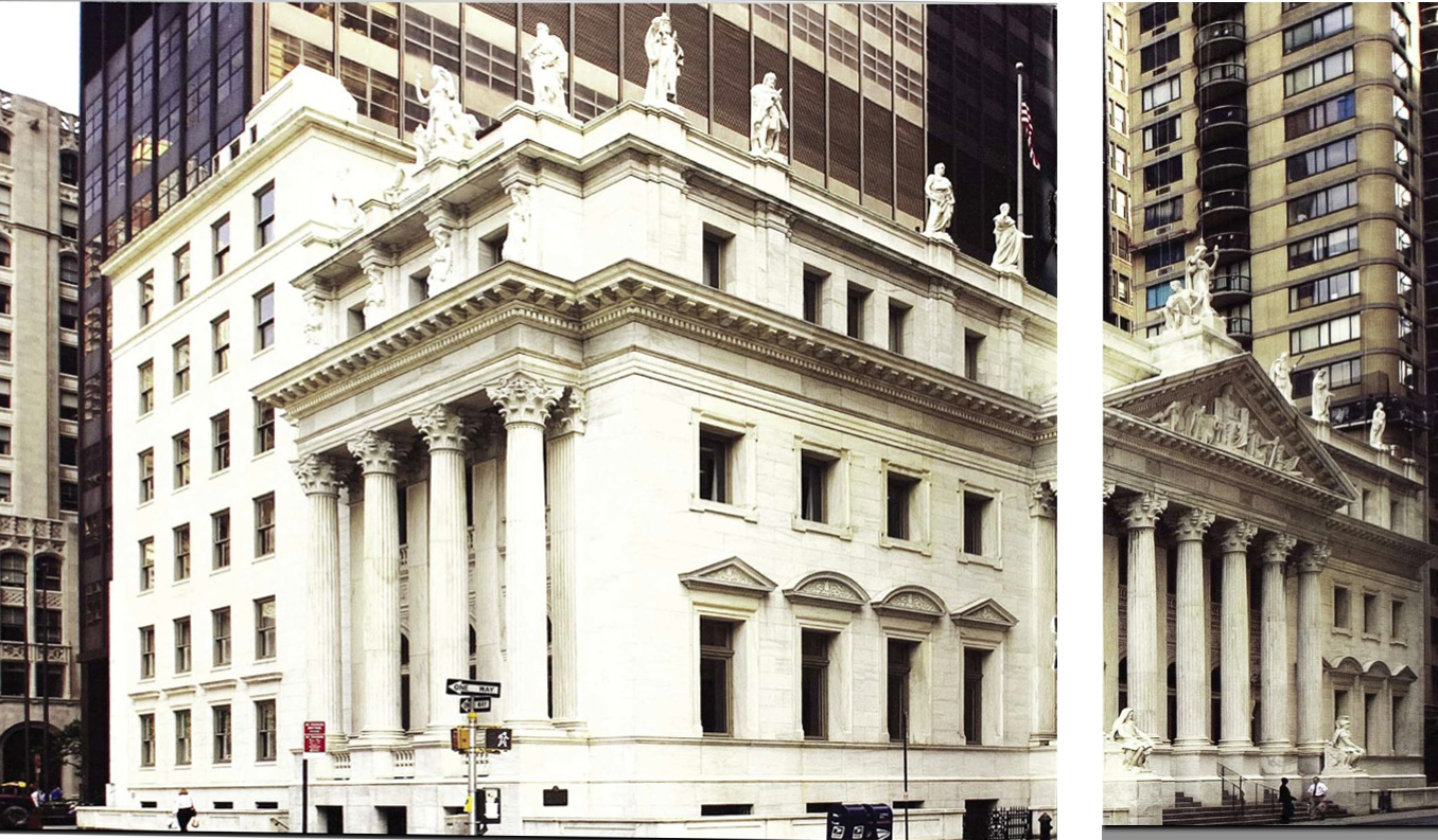
Sculpture of Mohammed in turban with curved sword in hand atop the New York Supreme Court Appellate Division, First Department in Manhattan  Courthouse c 1903


from the nonsearchable, crookedly scanned PDF from NYCourts.gov
When the Courthouse opened [it opened in 1900 and with the statues in 1901], a statue of Mohammed (580-632AD, representing Islamic Law, by Charles Albert Lopez, stood on the westernmost point of the roof facing 25th Street, where Zoroster is now positioned. In 1955, ;at the request of the governments of Egypt Pakistan, and Indonesia, the statue of Mohammed was removed and destroyed, since images of him are prohibited under Muslim Law. The statues that previously had stood to his left were each moved over one place, leaving an empty pedestal on the easternmost point.

The statue was destroyed! What a terrible waste of taxpayer dollars. 

 New York Supreme Court Appellate Division, First Department in Manhattan after the removal and destruction.
 New York Supreme Court Appellate Division, First Department in Manhattan before the removal circa 1903 (image from the Library of Congress).
Added : the muslim's objection is generally iconoclastic, that depictions of gods leads to the worshiping of the idols rather than the deity, so one has to wonder if people were worshiping the statue from the sidewalk? 

Sunday, November 9, 2014

Chuck Close at work part 2


(see also the post Chuck Close at work part 1 that showed the process of his post-photorealistic, prismatic grid work)


 Painting of John 1971-72 progression of various sections of the painting. The painting's size is 100 x 90 inches (8' 6" x 7' 6")
from Chuck Close Work page 78


 Chuck Close painting Mark 1978-79 (108 x 84 inches or 9 x 7 feet)
from Chuck Close Work page 86


Notice the 5 reference photos : magenta color separation, cyan color separation, then magenta+cyan color separation so he can check his progress, yellow color separations and magenta+cyan+yellow (the full color photo).

Chuck Close's approach to photorealistic painting is not what I expected. To achieve a slick photorealistic you pretty much have to approach it from a strict mechanical process but this wasn't what I expected. But it seems like a sensible approach : simplification and the use of technology.

He appears to begin, from top to bottom dividing the image into sections. A section is then painted from the magenta separation and once that is done that section is painted from the cyan separation with the magenta+cyan proof as an added reference. Then the section is painted guided by yellow separation. Only once the section is completed does he move on to another section

By painting one color at a time he is essentially doing 3 monochrome paintings albeit the second and third are atop a previous painting. Copying each color separation and using the magenta+cyan reference photos he reduces the problems of mixing colors correctly and consistently. Instead, he only has to do faithfully copy each color separation using a selection of values from light to dark of only a single color and the final color should come out correct.

Personally, I prefer his later "prismatic grid" works. Once you've seen a couple giant portraits they lose their uniqueness. They become enlarged photos. Photos enlarged by a very time consuming mechanical process like Chuck Close is an Epson printer. That is the point some might say but …


Pictures from the book Chuck Close Work by Christopher Finch (2010).

Monday, March 10, 2014

explosion


Explosion of the Spanish flagship during the Battle of Gibraltar, 25 April 1607 by Cornelis Claesz van Wieringen, c1621


The explosion isn't in Industrial Light and Magic style but it is interesting that the flames are in Spanish red and yellow. Note the sails of each ship are blown to the left while the Spanish ship's sails are all blown away from the center of the explosion

detail #1 (from near the top of the painting)
a brush for cleaning a cannon bore and 2.5 people


detail #2
a drum, 2 men and, likely, the other half of the guy seen in detail #1 (that must be one tight fitting hat). The guy at the bottom left appears to wear a bandolier of cartridges for his rifle or arquebus


Wednesday, March 5, 2014

Word of the Day : pandiculate


painting by and of Joseph Ducreux : Self-Portrait, Yawning,  before 1783. Oil on canvas, 45 x 35 in.
Self-Portrait, Yawning, Joseph Ducreux, before 1783. Oil on canvas, 45 x 35 in. 
pandiculate : To fully stretch the torso and upper limbs, typically accompanied by yawning.


Thursday, February 27, 2014

recto

This might help those who can't remember the difference between verso and recto.

Kneeling Nun, verso, by Martin van Meytens, c1731
click to embiggen
Kneeling Nun, verso, by Martin van Meytens, c1731

a notable detail of the painting revealed below

Tuesday, February 18, 2014

Chuck Close at work


photo of Chuck Close working on his painted portrait of Eric, 1990


Chuck Close at work. From Graphis Magazine #313 (no date printed but I think it is from around 1998) It is an interesting insight to how he works.  It looks like a two inch square grid at a 45º angle, he starts at the top blocking color in several rows, and then each grid tile is given a "dot."

 At first it might appear to be that he fills in a band of the grid from the top down but compared to the finished piece and there were changes made in the corners. Aside from the background there is a little use of line that extends outside of an individual grid box. For example, part of his glasses and part of the shirt collar.

The lift he uses to raise himself to paint higher portions of the painting appears to be a Big Joe Lift In-Between Handling Manual Stacker IBH1018 or a very similar model.


Another photo in the article shows Close working in a different workspace where the painting can be lowered down into a hole in the floor. When he moved studios he retired his Big Joe lift and started moving the painting. 

Below is the finished painting.

Saturday, February 15, 2014

Alphonse Mucha's wife and the painting Woman in the Wilderness

animated gif showing a detail of Alphonse Mucha's painting Woman in the Wilderness, 1923 with a fading in photograph of his wife Maruška posing for the painting.
detail of Alphonse Mucha's painting Woman in the Wilderness, 1923 juxtaposed with the photograph of his wife Maruška posing for the painting.
(click to embiggen)

seen here


painting titled Woman in the Wilderness, 1923, oil on canvas by Alphonse Mucha
Woman in the Wilderness, 1923, oil on canvas, 201.5 x 299.5 cm (79.3" x 117.9")
(click to embiggen)

an attempt to show the scale of the painting