Showing posts with label animatedGIF. Show all posts

Saturday, April 8, 2017

Art as a Creative Endeavor : Andy Warhol's Prince

Seen here


photograph of Prince, 1981 by Lynn Goldsmith
(I couldn't find a clean copy of the photo –this one is close –so this is taken from the lawsuit against the photographer by the Andy Warhol Foundation hence the oval around the eyes)


Prince by Andy Warhol, 1984

animated gif below the fold

Wednesday, November 16, 2016

Art as a Creative Endeavor : Caravaggio vs Rubens

The Entombment of Christ by Caravaggio, 1602-04

The Entombment of Christ by Peter Paul Rubens, 1612-1614

Peter Paul Rubens painted the altarpiece for the same church, Santa Maria in Vallicella in Rome, that hired Caravaggio to produce the chapel painting "The Entombment of Christ." He must have seen Caravaggio's work and been impressed. Or he thought he could improve it.

Interesting how faithful Rubens copies parts of Caravaggio's work but he also dramatically changes the composition. The man at the left in red (John the Evangelist) is moved significantly in pose and in position although his hand remains positioned on Christ's wound. The head of Christ is changed, as is the head of Nicodemus, holding Christ's legs. The hair of both have changed. The Italian Caravaggio had given them black hair while the Flemish Rubens gave them lighter hair I would guess to make it more relatable to the local audience or more relatable to himself. The color of Nicodemus' clothes is also changed.

The stone slab is more unfinished and painterly in Rubens' version. Rubens omits the plant at lower left.

Rubens also omits the woman with her arms upraised (Mary of Cleophas) probably because when people look at Caravaggio's version they connect her with the stout man legs below her belonging to Nicodemus. Mary Magdalene with her hand to her head and her head down is modified only slightly. The older woman would be the Virgin Mary which Rubens changed radically and added another woman beside her. Personally I like Caravaggio's Virgin Mary and Mary Magdalene in parallel next to each other with their heads bowed down together like a visual stutter.

Rubens painted several variations of the subject, perhaps the subject for future post.

As a bonus, Caravaggio's entombment of Christ as drawn by Paul Cezanne
The Entombment of Christ by Paul Cezanne

An attempt to show the scale of the paintings. The Caravaggio appears larger than life size.

below the fold is an animated gif comparing them

Friday, November 11, 2016

Art as a Creative Endeavor : Adolf Hitler

The pictures of Adolf Hitler's watercolor paintings are from the TV show "Bright Lights, Brilliant Minds : A Tale of 3 Cities" (2014) Season 1 Episode 1 "Vienna 1908" from BBC Four. The show covers three cities at particular times and their creative output.

First let me mention how annoying this presenter is. Dr. James Fox (not to be confused with the black Jamie Foxx)  is a total ham and makes a variety of assertions which he states with confidence but usually doesn't back them up.
Adolf Hitler spent 1905 to 1913 in Vienna, Austria as an aspiring artist. Below are the 3 examples of Hitler's work shown. I suggest that one of them might have been drawn from a photograph and that the other two were almost certainly drawn using a photographic reference.
St Charles Church (Karlskirche), Vienna watercolor by Adolf Hitler

The two columns are not parallel and they aren't the same height. The columns lean away from one another. The perspective of the capital at the top of the columns looks about correct but the top of the column on the left was drawn too high so it doesn't quite look right. When drawing from a photo sometimes the focus on copying means you miss the position of the details within the whole.


Austrian Parliament (Österreichisches Parlament) building watercolor by Adolph Hitler
in the background at center left is the Votivekirche church spires and to the right is the Burgtheater.

The first thing is the bird's eye perspective. It is possible that he went across the street from the parliament and drew it from the 3rd or 4th floor of the building across the street but it is doubtful.

This picture postcard of the Austrian Parliament and the drawing are very, very similar.  

photograph of the Austrian Parliament dated 1906

Now just because the perspective is the same doesn't mean he copied it from the photo. He could have coincidentally chosen the same viewpoint as the photographer. It could just be a coincidence that he included nothing outside of the boundaries of the photograph. He may have even chosen essentially the same composition. But would he have coincidentally included pedestrians (and a streetcar) in nearly the exact same places as in the photograph? 


But the third shown is the coup de grâce.
Vienna National Theater watercolor by Adolph Hitler
The presenter says about this :
"It's not hard to see why Hitler didn't get in [to the Vienna art school]. When you compare him with his contemporaries his quaint pictures of Vienna's historic landmarks seem embarrassingly old fashioned. This is a typical watercolor by Adolph Hitler. I'm slightly pained to admit that its not that bad. There is plenty of precise architectural detail, there is some evidence of perspective and actually his handling of the paint brush is quite confident. But you know what I find so interesting about it? This building, the National Theater, didn't even exist. In fact it had been demolished 20 years before Hitler even arrived in Vienna. But that's because Hitler was painting Vienna a hundred years out of date. A harmonious and eternal Vienna, the city that would never die."

This is what I mean by him making assertions and then failing to back them up. Did Hitler draw the building because it was an essential element of eternal Vienna or what I think is far more likely : he drew the building because that is what his reference photo showed. And if it had been demolished years before he arrived in Vienna how would he know it was part of eternal Vienna and how could he have included precise architectural detail of a building he had never seen.

If you didn't dislike Hitler before you should now that I've shown he was a cheater; a mere copyist and tinter of photographs taken by other people.

Sunday, November 6, 2016

Art as a Creative Endeavor : Edward Burne-Jones

Phyllis and Demophoon by Edward Burne-Jones, 1870
watercolor on paper,  93.8 x 47.5 cm (36.9 x 18.7 in)

The Tree of Forgiveness by Edward Burne-Jones, 1882
oil on canvas, 190.5 × 106.7 cm (75 × 42 in)

In 1870, Edward Burne-Jones exhibited Phyllis and Demophoon
Phyllis, Queen of Thrace, falls in love with Demophoon, son of Theseus. He departs but promises to return in six months' time. When he fails to keep his promise, Phyllis hangs herself, and is turned by the gods into an almond tree. On his eventual return, Demophoon remorsefully embraces the tree, which blooms, as Phyllis emerges to forgive and reclaim her faithless lover.
Both Phyllis and Demophoon are modelled on Maria Zambaco, with whom Burne-Jones had been having an affair since June 1868 (a host of studies exist for both figures, in various locales). And for this reason, in conjunction with Demophoon's nudity, a controversy ensued when it was exhibited at the Old Watercolour Society for the Summer Exhibition of 1870. Within two weeks of the exhibition's opening, Burne-Jones withdrew the painting due to complaints, and two works by other artists were exhibited in its place. In August 1870, Burne-Jones resigned from the Society, over artistic integrity.
In the catalogue for the Summer Exhibition at the Old Watercolour Society, Burne-Jones included the following caption, a quote from Ovid: 'Dic mihi quid feci? Nisi non sapienter amavi' [Tell me what I have done? I loved unwisely.] Burne-Jones later reworked the painting entirely in oils, transforming the bodies of both Phyllis and Demophoon into an homage to Michelangelo, calling it 'The Tree of Forgiveness' (1882, Lady Lever Art Gallery, Port Sunlight), where Zambaco's face remains only on Phyllis.

The Tree of Forgiveness, 12 years later,  is about life sized. The figures are not identical to the previous version but they are remarkably similar and the concept is the identical. The colors are different. in the 1870 painting Demophoon looks slight and ashen.

The drapery in Phyllis and Demophoon covered Phyllis' body along with her arm covering her breast and the magical drapery wrapped itself around Demophoon's leg without providing him any modesty (modesty in the sense of avoiding impropriety or indecency but modest in the sense of "a small amount" could be used to describe him). In contrast, in The Tree of Forgiveness magical drapery covers his manhood and flowingly wraps around his leg and only his leg while she is exposed fully nude.

It is interesting that Michelangelo depicted women by drawing men and the "feminizing" them and Burne-Jones in Phyllis and Demophoon drew a woman and then "masculinized" the figure.


An attempt to show the scale of the pictures.

below the fold is an animated gif contrasting the two.

Friday, March 18, 2016

flashing light

A Yarra councillor wants to see more ‘green and red lady’ pedestrian signals installed across the inner city to promote gender equality. 
Yarra Council and VicRoads announced yesterday the silhouette of a woman would be installed at a new pedestrian crossing in Richmond. 
 Crossing the street shouldn’t be a problem. By the looks of her, she’s from an era that predates cars. Those skilled in the dark arts of photoshop are invited to submit a more modern design.


My submission : 
I figure if the light flashes it'll get people's attention (if it were animated it'd be even better).


Update: animated gif below the fold

Monday, May 4, 2015

Deconstructing Roy Lichtenstein


Roy Lichtenstein became famous making large versions of comic book panels.
David Barsalou went to the trouble to discover who Roy Lichtenstein was copying.


wiki says :
Favoring the comic strip as his main inspiration, Lichtenstein produced hard-edged, precise compositions that documented while it parodied often in a tongue-in-cheek humorous manner. His work was heavily influenced by both popular advertising and the comic book style. 


Frankly, some of his "precise compositions" were composed by someone else.


Lichtenstein didn't always make exact copies of the source drawings, but in my opinion, even when he did make copies he tended to make the drawings worse.


(animated GIF comparison of Lichtenstein's In the Car to the original image below the fold)

Tuesday, October 14, 2014

Olve Oyl and all her curves

Olve Oyl and all her curves. Risque animation below the fold

Thursday, February 27, 2014

recto

This might help those who can't remember the difference between verso and recto.

Kneeling Nun, verso, by Martin van Meytens, c1731
click to embiggen
Kneeling Nun, verso, by Martin van Meytens, c1731

a notable detail of the painting revealed below

Tuesday, February 18, 2014

Chuck Close at work


photo of Chuck Close working on his painted portrait of Eric, 1990


Chuck Close at work. From Graphis Magazine #313 (no date printed but I think it is from around 1998) It is an interesting insight to how he works.  It looks like a two inch square grid at a 45º angle, he starts at the top blocking color in several rows, and then each grid tile is given a "dot."

 At first it might appear to be that he fills in a band of the grid from the top down but compared to the finished piece and there were changes made in the corners. Aside from the background there is a little use of line that extends outside of an individual grid box. For example, part of his glasses and part of the shirt collar.

The lift he uses to raise himself to paint higher portions of the painting appears to be a Big Joe Lift In-Between Handling Manual Stacker IBH1018 or a very similar model.


Another photo in the article shows Close working in a different workspace where the painting can be lowered down into a hole in the floor. When he moved studios he retired his Big Joe lift and started moving the painting. 

Below is the finished painting.

Saturday, February 15, 2014

Alphonse Mucha's wife and the painting Woman in the Wilderness

animated gif showing a detail of Alphonse Mucha's painting Woman in the Wilderness, 1923 with a fading in photograph of his wife Maruška posing for the painting.
detail of Alphonse Mucha's painting Woman in the Wilderness, 1923 juxtaposed with the photograph of his wife MaruÅ¡ka posing for the painting.
(click to embiggen)

seen here


painting titled Woman in the Wilderness, 1923, oil on canvas by Alphonse Mucha
Woman in the Wilderness, 1923, oil on canvas, 201.5 x 299.5 cm (79.3" x 117.9")
(click to embiggen)

an attempt to show the scale of the painting


Monday, July 29, 2013

Mutants need love too

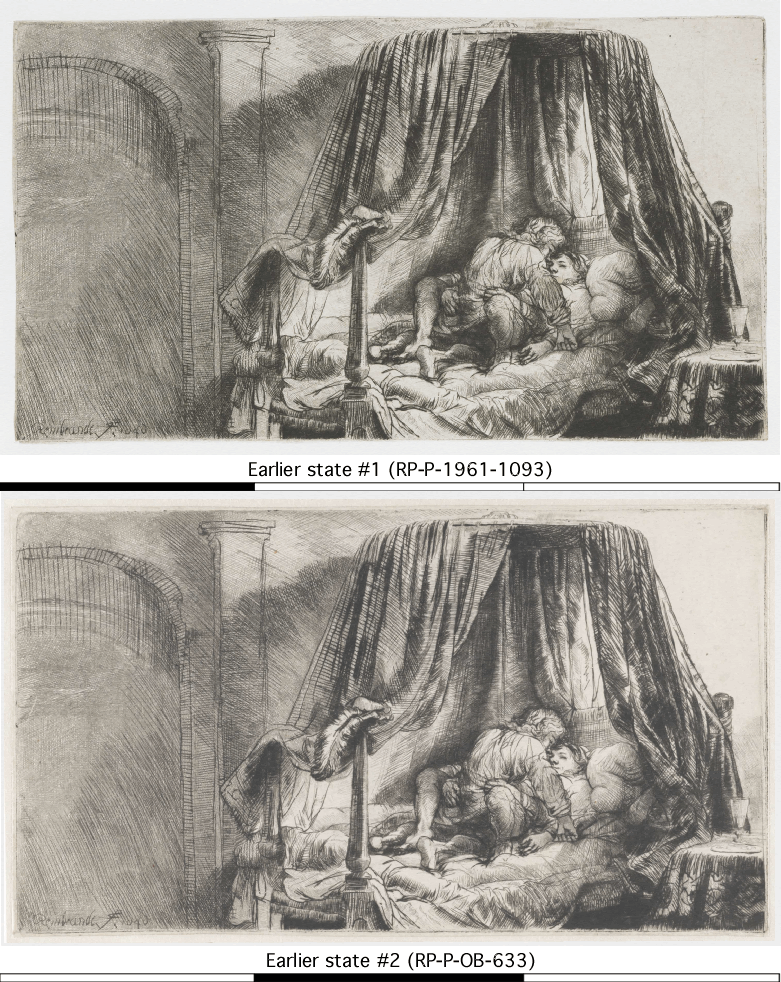
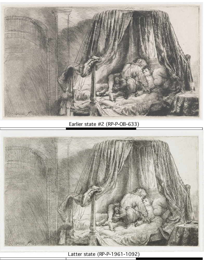
Rembrandt's etching Ledikant
Rembrandt's Ledikant
Het Ledikant (The Bedstead) also called Le Lit A La Française (the French Bed)  by Rembrandt van Rijn, 1646
etching, height 125mmx width 224 mm


The subject matter is pretty unambiguous to most people. The book Rembrandt and His Work (1899) describes it as "A very rare plate, which need not be described".  The dutch genre was apparently called "boelering" which is dutch for "cohabitation." Rembrandt was 40 years old at the time so I would suggest he qualifies as a dirty old man.

The alternate title, "French bed," is the name curtained beds were known by.  The open bed curtains add to the voyeurism. Hanging off the end of the bedpost is his hat with a large feather in it. On the left is an arched doorway and to the right is a table with a glass and plates on a bedside table.

Both sixes in the date are printed backwards. That is to say they were not etched onto the plate backwards.

There are several different states to the etching. With each revision was it unnoticed that she has 3 hands (one right and 2 left hands)? Assuming, she doesn't have 4 arms and that the second right hand simply isn't shown. Or maybe the intent was to imply a kind of motion.

From a Descriptive Catalogue of the Prints of Rembrandt (1836) :
First impression There is a margin at top and the plate measures 6 in by 8.9 in
At the bottom of the door leading from the recess is written Rembrandt f 1646
Second impression The margin is cut off it is extremely rare and measures 5 in by 8.9 in
There is much of the bur in this impression
Third impression It is very scarce the recess and door with the name are cut off it measures 5 in by 6.9 in

It has been suggested that the final state was trimmed out of shame to take off Rembrandt's name.

The British Museum says there are at least 4 states to the plate. The Rijksmusuem possesses at least 3 different states of the print :

  • RP-P-1961-1093 
  • RP-P-OB-633
    • man's arm burnished 
    • add a bit of smile to the woman's face 
    • (animation showing the differences between RP-P-1961-1093  and RP-P-OB-633)
  • RP-P-1961-1092 
    • darkened the leftmost bedpost
    • crosshatching on the side table
    • add shadow of the plate on table
    • altered the bedding hanging down
    • refined the curtain rod
    • (This is the image shown at the top of the post. Animation showing the differences between  RP-P-OB-633 and RP-P-1961-1092. Or an animation comparing all three).
an attempt to show the size and scale of Rembrandt's Ledikant
an attempt to show the size and scale of the etching

Wednesday, July 3, 2013

Transformation of Antiques magazine cover into the Apparition of a Face (1974) by Salvador Dali

Transformation of Antiques magazine cover into the Apparition of a Face (1974) by Salvador Dali
click to embiggen

Transformation of Antiques magazine cover into the Apparition of a Face (1974) by Salvador Dali
Paranoiac-critical conversion 
11.5" x 8.75"


Dali modified the magazine cover to show a woman's face. Below is the original image from the cover of Antiques the Magazine January 1974. 
Antiques the Magazine January 1974 cover


below the fold is a slow blinking animated gif contrasting the source image with Dali's modified image.

Thursday, December 13, 2012

Goya's Maja

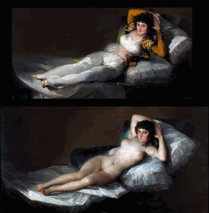
animated GIF alternating between Francisco Goya's Maja nude (La maja desnuda) and his Maja clothed (La maja vestida) making it look like the quickest striptease ever


A comparison of Francisco Goya's Maja nude (La maja desnuda) and his Maja clothed (La maja vestida). I had thought that they were the same figure with clothes painted on one but they are not an exact match.

And although the canvases are the same size (38 x 75 inches) the nude figure is smaller (the clothed figure had to be scaled down to make the comparison)

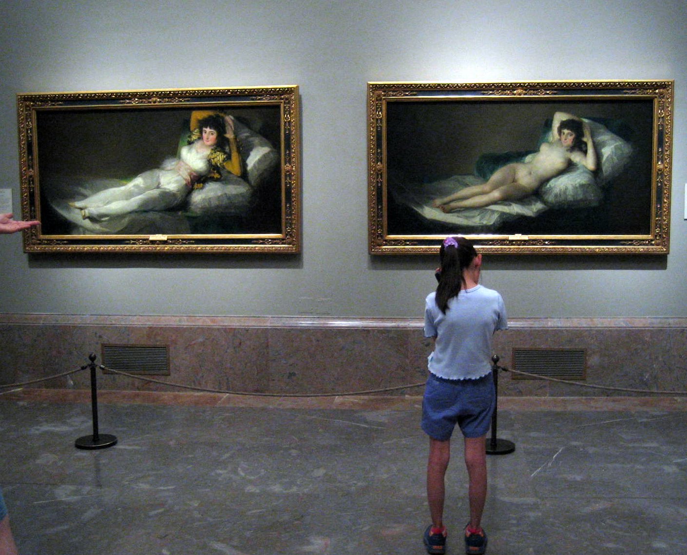
photo of Francisco Goya's Maja Nude and Maja Clothed side by side at the Prado
photo of Las Majas side by side at the Prado, Spain