
and for those who don't celebrate Christmas:
Thursday, December 26, 2013
A Star Trek Christmas
and for those who don't celebrate Christmas:
Saturday, December 21, 2013
desirable location, easy access, spacious, rustic
 |
| maps of San Francisco showing median household income in 1990 and in 2012 |
This article says:
To illustrate the widening gap between the rich and poor in cities like San Francisco and New York, the Census Bureau has created map images that show the difference of income in respective cities from 1990 and 2012.
The light yellow indicates less that $35,000 while the dark brown indicates greater than $75,000.
I'm not sure if it shows "the widening gap between the rich and poor" as the median income appears to have increased in many areas. It also doesn't give a feel for the population density.
Note the yellowish horizontal strip on the upper left side of the left map. That pale yellow strip on the left map is Golden Gate Park and apparently it has become one of the wealthier areas of the city by 2012.
Checking the Census source one finds that the median household income for Golden Gate Park has risen from $0 in 1990, to $32,101 in 2000 and to $100,938 in 2012 (all in 2012 dollars).
Not bad for a park.
(I would bet the jobsworth census workers were assigned an area to canvas and interviewed whoever they found in it then it seems the park employees must be doing very well for themselves, especially if the sample included some of the city's homeless. That or some of the homeless are overly optimistic about the state of their finances)
Monday, December 16, 2013
Phillip Adams : totalitarian crankypants

Phillip Adams is an old Australian lefty with a newspaper column, a radio show, and apparently a bit of a totalitarian streak.
The target of the US war on terror should be those NRMA nutters-who outgun and outmaneuver every challenger from POTUS down.And always have
NRMA is a typo for the NRA (National Rifle Association). (Or it isn't a typo and Adams has strong feelings about the National Roads and Motorists Association)
So, Phillip wants the US government to arrest and/or bomb people for engaging in free speech, questioning ideas, and peaceably petitioning the government. Who knew that merely advocating for one's explicit Constitutional rights would get you demonized as a terrorist.
Notice it isn't the people actually committing the murders that he wants to targeted but the NRA. Keep quiet about my support for the Third Amendment or he might call for my hands to be cut off.
Presumably, if the NRA were less successful then Phillip might tolerate their free speech and might not want them dead. Maybe.
I'm sure all of those who fret over civility and campaign against eliminationist rhetoric will be up in arms and demand that he be denounced. Phillip Adams will be outraged when he hears what he's been saying. Here's Phillip Adams from Sept 10, 2011 :
By the way, "It was widely accepted that her [Gabrielle Giffords] attempted assassination was triggered, no pun intended, by the verbal violence of US politics" was written a full 8 months after the shooting – that is, long after everyone but Phillip Adams realized Jared Loughner was motivated by being coo coo for cocoa puffs.
It was widely accepted that her [Gabrielle Giffords] attempted assassination was triggered, no pun intended, by the verbal violence of US politics – such as the “lock ’n’ load” rhetoric of gun-totin’ Sarah Palin, whose campaign literature literally targeted political opponents, depicting them in the crosshairs of telescopic sights.
…
While sticks and stones break bones, words can never hurt? Manifestly untrue. Politics everywhere are holistic, interconnected, and the rhetoric of right or left can produce toxic atmospheres in which lunacy thrives.
…
It’s not enough for Abbott to tell us he “doesn’t entirely agree” with vile placards being waved at right-wing rallies. He must denounce them.
…
Today, words. Tomorrow, sticks and stones. And the day after that?
Update : Here is some inflammatory demagoguery I've heard more than once.
To arms, citizens,
Form your battalions,
Let's march, let's march!
That impure blood
May water our furrows!
...
Tremble, tyrants and you traitors
The shame of all parties,
Tremble! Your parricidal schemes
Will finally receive their reward!
Not only does it call for violence it also refers to the "enemy" tyrants and traitors as having "impure blood" which is a creepy bit of racial demogoguery. We can only hope Phillip Adams will do something about it before it kills us all.
Update II : On reflection, if Adams considers the NRA to be terrorists then perhaps his opinion about terrorists should be explored.
In a column in the Australian July 12, 2005 titled "Britain had this coming" Adams explains :
And let's be clear about it: the people who died in the subway tunnels and on the bus were victims of the Iraq war. They died because of Blair's London Bridge, the one he built from the Thames to the Euphrates
.…
We say that what's happening in Baghdad and now London is inevitable, that the invasion has not liberated democratic forces but detonated more hatred, much of it directed against US hegemony and hubris.
Adams appears to think that terrorists lack an agency of their own and only react to outside stimulus. I think this means Phillip wants to examine the NRA's root causes and conscientiously avoid doing anything that might provoke the NRA or its members into engaging in more of that free speech he finds so odious.
Update III : Phillip's twitter tirade includes "National Ratbags. National Racists. …The charnel house of Charlton Heston … those NRMA(sic) nutters" with all this incivility and "verbal violence" it raises the question : it seems Phillip is trying to provoke someone into murder, does he have a victim in mind? (assuming he believes his own writings)
Thursday, December 5, 2013
Lou Reed (1942 - 2013)
Note at the end when it almost sounds like booing but is actually people yelling "Louuuuuuu!"
Lou Reed is dead, Sam Kinison is dead, who knows who else in the video is dead. Someday there will probably be an app that will mark everyone in a video who has died with a little tombstone and the date of death.
Lou Reed was one of my all time favorite musicians. His singing style is close to spoken word but it is a style of singing. My theory is that he sang that way on purpose to focus the audience's attention on the lyrics. There is an honesty in his way of singing that can be subtle.
I think in the 90s, Lou was interviewed by a very earnest Charlie Rose and was asked why the Velvet Underground reunion didn't stay together (specifically John Cale) and tour the US. Lou responded with something like "Uh, that's because we hate each other." Refreshing honesty and straightforwardness.
His volume of work is extensive and between the Velvet Underground and his solo career there are a huge number of songs I like. I don't think I'd recommend Metal Machine Music to anyone who likes his lyrics.
There is a difference between Lou solo and Lou with the Velvets performing the same song.
Monday, December 2, 2013
movie notes : the Pruitt-Igoe Myth
 |
| The Pruitt-Igoe Housing Project being given up on as a failure and imploded after only 18 years after taking over $300 million (in 2013 dollars) to build. |
I've strung together a few clips that I found interesting. Below is a partial transcript of those clips and some commentary.
The Myth of the Pruitt-Igoe Myth
clip one - introduction
The Pruitt-Igoe public housing development in St Louis, Missouri was opened in 1954 and demolished in 1972.
"What caused the failure? The Pruitt-Igoe myth begins here. … Some blame the architect, Modernist high rises like Pruitt-Igoe the say created a breeding ground for isolation, vandalism and crime … Others attacked the welfare state. Big government, the problem and Pruitt-Igoe the result. … Many stated flatly that the residents were too poor, uneducated or rural. That they caused their own problems and had taken Pruitt-Igoe with them. … Long after the dust settled and the site was cleared this was the Pruitt-Igoe that remained. The mythical Pruitt-Igoe with a fatal flaw, doomed to failure from the start."here is your myth checklist :
- modernist architecture
- the welfare state
- the residents caused their own problems
clip two - conclusion (starts at 3:25)
"The implosion footage was so shocking just because there was still in people's minds the idea that this had been the solution. It was a very painful moment of truth to see that failure. That's why in many ways that Pruitt-Igoe is not just the national and even the world symbol for the failure of American public housing it's also been a symbol for the perceived failure of well intentioned government policies in general. And that's why I think its so important to look beyond the famous pictures of the towers being destroyed and really try to understand what failed and why. In some ways Pruitt-Igoe failed because housing alone couldn't deal with the most basic issues that were troubling the American city. There was just no way to build your way out of that tragedy. I think we have a responsibility to understand those failures and to learn from them and to do better." – Robert Fishman (urban historian)
…
"We don't want people to think of Pruitt-Igoe as a failure if they're going to then to translate that failure into all public housing or all government programs or all social welfare or all modernism. That is what Pruitt-Igoe has been freighted with. If we want to say that this one project, in this one place, for this one set of reasons declined to the point where people thought it was necessary to tear it down that's one thing. But that's simply not how we've told the story."
What a bizarre standard for judging failure! If someone suggests a systemic problem then people should pretend Pruitt-Igoe was a roaring success? That attitude makes me doubt how much some people want to learn from the failure if they refuse to consider some potential causes.
The bigger story is in fact the decline of the city overall. What happened to St Louis was tragic. It's kind of a slow motion Katrina in a way. St Louis lost half its population and had a devastated tax base and a drained economy over the course of 50 years from World War II even to the present. It's no wonder Pruitt-Igoe declined in those circumstances. I mean, it would be hard to imagine a public housing project surviving under those conditions" – Joseph Heathcott
Did other housing survive? Did other neighborhoods in St Louis survive? If so then it suggests that there might have been something unique to Pruitt-Igoe being a government project and in being a political project.
clip three - planning and control (starts at 6:11)
"Before we moved into Pruitt-Igoe, the Welfare Department came to our home, they talked with my mother about moving into the housing project but the stipulation was that my father could not be with us. They would put us into the housing projects only if he left the state. My mother and father discussed it and they decided it was best for the 12 children for the father to leave the home. And that's how we got into the projects" – Jacquelyn Williams (former resident)Gee, what could go wrong. Surely, the Welfare Dept. didn't see itself as splitting a family apart and positioning the government and/or modernist architecture to be a replacement parent. I bet the Department was mostly concerned not with any consequences but if it could recruit enough residents to meet the bureaucracy's expectations. Unfortunately, the filmmakers didn't let us know if her parents came to regret that decision.
"The Welfare Department had a rule that no able bodied man could be in the house if a woman received aid for dependent children. If a man lost his job and was looking for work he still had to leave the home. There was even a night staff of men who worked for the welfare department whose job was to go to the homes of the welfare recipients and they searched to find if there was a man in the home." – Joyce Ladner (sociologist)
"There were so many restrictions. We couldn't have a telephone. We couldn't have a television." – Jacquelyn Williams (former resident)
The rules of the housing project concerning TVs were changed a few years later. I'm not sure about the phone rule. Sometimes control is about control.
clip four - "unbreakable" (starts at 9:45)
"I think it created a mindset for the inhabitants that they weren't cared about and I think that manifested itself in a way that caused more harm to the tenants than an other entity. The vandalism that existed at Pruitt-Igoe came from that environment. Things allowed to just deteriorate and people not really caring. And so management decided, well instead of trying to enhance their existence we'll just make things so they can't be destroyed. Everything had to be protected. Light fixtures; no light exposed and shields around them with mesh metal protecting the bulb. Y'know, the fact that it was indestructible made you want to try to destroy things." – Brian King (former resident)This does seem inherent to public housing as when most people destroy their own property they find that they have to spend their own money to replace it. The modernist dream of regimenting people into designated communal areas led to a tragedy of the commons.
"There was a screen around the lightbulb that kept you from breaking them. Y'know, kids'll be kids, find a way to break 'em. … they took all the lights off the elevator, put 'em, recessed them up into the ceiling and then they tried to cover that up with plexiglass but sometimes people would try to set that plexiglass on fire. Sometimes instead of taking the trash and putting it inside the incinerator, they just set it on fire right out there in the middle of the floor… After I moved away from Pruitt-Igoe, I went on to become a police officer with St Louis City… I do remember people calling the police and trying to come into the buildings and the would drop just anything they could find. Trash; throw trash out the window. I remember that. I remember them throwing firebombs out onto the police cars. I remember they did that. So there is enough blame to go around." – Valerie Sills (former resident)
"I don't think that people rationalized that somebody's house burned down or people could be killed. I think they just saw that firetruck or that police car or that ambulance as the enemy. It was just bitter people, angry people and that was a way of making a statement. We're not happy here and we want you to know it. And the way you gonna know it is these bricks and bottles will rain down on you no matter who it's saving , no matter how relevant or important it is. We want you to understand you're not welcome here." – Brian King (former resident)
Contrary to Le Corbusier and the Modernists, communities are built through human interaction and individual decisions and do not spring into existence as soon as an architect declares something to be communal property. I don't think it would be too harsh to suggest that some of the residents "caused their own problems" as I think most would consider their home being on fire to be a problem.
The movie suggests that the problems with Pruitt-Igoe were caused not by modernist architecture, the welfare state or some of the residents but by was racism, housing discrimination, segregation and the rise of suburbanism. This seems less convincing when one realizes that blacks lived in places other than Pruitt-Igoe and lived there successfully without lighting the place on fire or shattering their own light bulbs. It is true that a person can die if they have no food for a month but that does not mean that it isn't also true that a person can die from a lack of oxygen.
From the Housing & Urban Development publication Creating Defensible Space by Oscar Newman (April 1996) p11 (PDF)
"Across the street from Pruitt-Igoe was an older, smaller, rowhouse complex, Carr Square Village, occupied by an identical population. It had remained fully occupied and trouble-free throughout the construction, occupancy, and decline of Pruitt-Igoe."
Thursday, November 14, 2013
How Orwellian : Women live longer than ever – women hardest hit
 |
| map of US life expectancy gender gap (here) |
The headline is "U.S. Life Expectancy Map: The Gender Gap" with the subhead "Ladies Last" on this National Geographic piece by Amanda Fiegl
How long do you have? It depends on gender and geography. In the U.S., women live longer—81 years on average, 76 for men—but a recent study by the Institute for Health Metrics and Evaluation reveals a troubling trend. Though men's life spans have increased by 4.6 years since 1989, women have gained only 2.7 years, perhaps because a larger percentage of women have lacked adequate treatment for high blood pressure and cholesterol. "This is a wake-up call," says study co-author Ali Mokdad.
The question remains whether the "troubling trend" is that men's life expectancy has increased or if the troubling part is that women life expectancy increased less than men.
Despite the article's subhead reading "Ladies Last" the map is labeled "Margin by which women outlive men" with, apparently, no areas of the US where men outlive women. Poor, poor ladies last.
In looking for the context of the quote "This is a wake-up call" this USA Today article shows that Ali Mokdad was referring not to men's increase or the comparative increase of women's but to some areas that have had a stagnation or decrease in life expectancy.
Amanda Fiegl's blinkered one-sidedness is similar to the WEF Gender Gap report mentioned previously.
Monday, November 11, 2013
Charles P. Pierce is an idiot
(a reprise from elsewhere from the day of the Boston Marathon Bombing (Apr 15, 2013) but as far as I'm aware Charles P. Pierce is still an idiot.)
from Charles P. Pierce at Esquire :
"Obviously, nobody knows anything yet, but I would caution folks jumping to conclusions about foreign terrorism to remember that this is the official Patriots Day holiday in Massachusetts, celebrating the Battles at Lexington and Concord, and that the actual date (April 19) was of some significance to, among other people, Tim McVeigh, because he fancied himself a waterer of the tree of liberty and the like."
Don't jump to conclusions about foreigners when you can jump to conclusions about your fellow citizens.
-----------------
that this is the official Patriots Day holiday in Massachusetts, celebrating the Battles at Lexington and Concord, and that the actual date (April 19) was of some significance to, among other people, Tim McVeigh.
Follow the logic :
- there is a bombing on April 15
- April 15 is Patriot's Day in Massachusetts (third Monday in April since 1969)
- Patriot's Day in Mass used to be on April 19
- In 1995, Patriot's Day fell on April 17 and Tim McVeigh (b. 1968) said his act of mass murder was done on April 19, 1995 as that was the anniversary of the end of the Waco Seige.
- Therefore there might be a connection between McVeigh's bombing on April 19 and the April 15 Boston Marathon bombing.
- Connect the dots, Sheeple!
Although it may have missed the grasp of Charles P. Pierce, my guess would be that the date of the Boston Marathon bombing was chosen based on the date that the Boston Marathon was scheduled to be held. Imagine the Groundhog Day Liberation Front trying to bomb the Boston Marathon on Feb 2.
Wednesday, November 6, 2013
Art as a Creative Endeavor : Ingres vs Romans
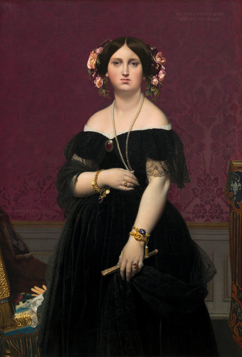
JAD Ingres painted 2 portraits of Madame Moitessier (born Marie-Clotilde-Inès de Foucauld). The first one he started working on is the seated portrait below. It was commissioned in 1844, drawn onto the canvas by 1847 but not completed until January of 1857.
The second (or the first one completed) was started and finished in 1851 and is the portrait of her standing which is now at the US National Gallery of Art and mentioned previously.
The second (or the first one completed) was started and finished in 1851 and is the portrait of her standing which is now at the US National Gallery of Art and mentioned previously.
.

click to embiggen
Portrait of Madame Moitessier Seated by Jean-Auguste-Dominique Ingres, 1851
oil on canvas, 120 cm × 92 cm (47 in × 36 in), British National Gallery, London, UK
Portrait of Madame Moitessier Seated by Jean-Auguste-Dominique Ingres, 1851
oil on canvas, 120 cm × 92 cm (47 in × 36 in), British National Gallery, London, UK

Roman Fresco of Hercules and Telephus from the ruins of Herculaneum, 1st century AD
 |
| Roman Fresco of Hercules and Telephus in color (Telephus is Hercules' son and is being suckled by the doe in bottom left) "Herakles Finding His Son Telephus" 79.5 x 63.375 in, Musei Nazionale, Naples, Italy |
Ingres' original concept was to include Moitessier's daughter in the painting. However, the child did not sit well and progress on the painting took years. One wonders, would she have been the child behind the sitting woman (the pan flute makes me think it might be a satyr) or the child suckling a deer?
The pencil drawing above superimposed onto the painting shows the oval head of Mme Moitessier's daughter, Clotilde-Marie-Catherine who was born March 19, 1843. That means at the time of the commission Clotilde was one year old, at the time of the pencil drawing she was 3 to 5 years old, and at the time of completion little Clotilde was nearly 14. The pose of the small child would be less suitable for a teenager.
Also worth noting is the second portrait in profile in the sitting portrait. It is ostensibly reflected in the mirror but to get that reflection the mirror would have to at a different angle instead of flush on the wall.
 |
| Study for the Portrait of Madame Moitessier Seated by Jean-Auguste-Dominique Ingres superimposed on the painting, c1846-48, graphite on paper 6.375 x 4.625 inches (16.2 x 11.8 cm) |
Also worth noting is the second portrait in profile in the sitting portrait. It is ostensibly reflected in the mirror but to get that reflection the mirror would have to at a different angle instead of flush on the wall.
 |
| detail of the swollen octopus like hand |
 | |
|
Sunday, November 3, 2013
French lesson
 |
| click to embiggen Standing Portrait of Madame Moitessier by Jean-Auguste-Dominique Ingres, 1851 Oil on canvas 57.75 x 39.5 inches (146.7 x 100.3 cm) |
I've come across a lot of foreign words over the years. I've roughly translated articles from foreign languages so I could read them and after a while one notices some words are shared between languages, some have a shared origin and so are similar, some words are easy to remember and sometimes you can guess the word based on the context.
For example, in French "terrible" means "terrible" and "et" means "and" in both French and Latin and the French word "Belle" besides being easy to remember is also similar to the Spanish and Italian words for beautiful.
Anyways, the painter Ingres decided to paint Mme Moitessier after meeting her and being struck by her appearance. He described as "terrible et belle tête."
It is usually best to double check a translation; "terrible et belle tête" despite fitting in with the context does not mean what I initially assumed. It turns out tête is French for head.
More phony egalitarianism
To continue a critique of the World Economic Forum's Global Gender Gap report started here.
Bizarrely, 0.9796 is the highest score for any country listed in the Health and Survival category (p19). Even Kazakhstan (p240) which is listed with an inverted sex ratio at birth* (1.06 – more girls are born than boys while in every other country listed has more boys born than girls) and women have a much higher life expectancy than men (60 for women and 53 for men; a 1.13 ratio) their score still maxes out at 0.9796 – still shy of the "equality" score of 1. The WEF must really hate women to define their terms so women can never be equal.
Even keeping in mind that they truncate the subcategory scores at the "equal" levels (the Kazakh sex ratio of 1.06 is truncated to 0.94 and the Kazakh life expectancy of 1.13 is truncated to 1.06) I'm not sure how Kazakhstan could be scored at less than one.
Update : on page 36 are footnotes #6 and #7 which read :
0.693 * 0.94 = 0.65142
0.307 * 1.06 = 0.32542
0.65142 + 0.32542 = 0.97684
On page 35 they state "On average, in 2013, over 96% of the gap in health outcomes… has been closed. No country in the world has achieved gender equality."
The average Health and Survival score I came up with (using their truncated scores from p12-13) is 0.97115. That is 99.1% of the maximum possible score of 0.9796. If they didn't truncate at their life expectancy equality maximum and used a definition of life expectancy "equality" that didn't depend on men living a shorter span then the global life expectancy average would be 1.0586 - in the real world that would be men suffering inequality.
(* as an aside, Kazakhstan sex ratio at birth appears to be incorrect. The CIA World Factbook also lists the sex ratio at birth to be 0.94 male(s)/female but for the sex ratio of the 0-14 years cohort as 1.01 male(s)/female; and the total population sex ratio as 0.92 male(s)/female (2013 est.). The total population ratio is consistent with the life expectancy while a massive die off of girls 0-14 years doesn't seem to be reflected in the life expectancy numbers. It appears the male/female sex ratio numbers were transposed. Update : the WEF and the CIA appear incorrect; the Kazakh sex ratio according to Kazakhstan government statistics has been 1.06 males/females for each year from 2006-2010 – pdf page 12)
Political Empowerment Rank 29, Score 0.275
Years with female head of state (last 50)
I see 2 problems with this aside from the worthwhileness of the subcategory in assuming the importance of a single person and that it is a score based largely on the distant past.
First, 12 divided by 38 is 0.31578 not 0.30. To claim precision to the ten-thousandths (as in the overall Political Empowerment category score p19) and then to round a subcategory seems odd. They appear to be using whole numbers in the subcategories but calculating with more more precise numbers (Thatcher's 11.5years /38.5 = 0.2987)
Second, Queen Elizabeth II is the head of state of the United Kingdom and has been since 1952. So the score should be 1 (as their policy is to truncate the score at the "equal" value)
Ah, I see that on page 4 they chose to redefine the head of state :
For everyone except the WEF, the head of state of New Zealand is the aforementioned Queen. Using the WEF's definition of head of state we find that the WEF thinks Helen Clark and Jenny Shipley were male as they list the number of years with a female head of state as zero (p296). They must not consider the Governor-General to be the head of state as more than 10 years of Governors-General have been female. Perhaps New Zealand has a secret phallocratic government.
| Kazakhstan - Health and Survival women are doomed! |
Bizarrely, 0.9796 is the highest score for any country listed in the Health and Survival category (p19). Even Kazakhstan (p240) which is listed with an inverted sex ratio at birth* (1.06 – more girls are born than boys while in every other country listed has more boys born than girls) and women have a much higher life expectancy than men (60 for women and 53 for men; a 1.13 ratio) their score still maxes out at 0.9796 – still shy of the "equality" score of 1. The WEF must really hate women to define their terms so women can never be equal.
Even keeping in mind that they truncate the subcategory scores at the "equal" levels (the Kazakh sex ratio of 1.06 is truncated to 0.94 and the Kazakh life expectancy of 1.13 is truncated to 1.06) I'm not sure how Kazakhstan could be scored at less than one.
Update : on page 36 are footnotes #6 and #7 which read :
6 This is not strictly accurate in the case of the health variable, where the highest possible value a country can achieve is 0.9796. However, for purposes of simplicity we will refer to this value as 1 throughout the chapter and in all tables, figures and Country Profiles.So where does 0.9796 come from and why not make it conform to the standard of 1? The weighting mentioned on p5-6 doesn't seem to do it or I may be doing it wrong.
7 Because of the special equality benchmark value of 0.9796 for the Health and Survival subindex, it is not strictly accurate that the equality benchmark for the overall index score is 1. This value is in fact (1 + 1 + 1 + 0.9796) / 4 = 0.9949. However, for purposes of simplicity, we will refer to the overall equality benchmark as 1 throughout this chapter.
0.693 * 0.94 = 0.65142
0.307 * 1.06 = 0.32542
0.65142 + 0.32542 = 0.97684
On page 35 they state "On average, in 2013, over 96% of the gap in health outcomes… has been closed. No country in the world has achieved gender equality."
The average Health and Survival score I came up with (using their truncated scores from p12-13) is 0.97115. That is 99.1% of the maximum possible score of 0.9796. If they didn't truncate at their life expectancy equality maximum and used a definition of life expectancy "equality" that didn't depend on men living a shorter span then the global life expectancy average would be 1.0586 - in the real world that would be men suffering inequality.
(* as an aside, Kazakhstan sex ratio at birth appears to be incorrect. The CIA World Factbook also lists the sex ratio at birth to be 0.94 male(s)/female but for the sex ratio of the 0-14 years cohort as 1.01 male(s)/female; and the total population sex ratio as 0.92 male(s)/female (2013 est.). The total population ratio is consistent with the life expectancy while a massive die off of girls 0-14 years doesn't seem to be reflected in the life expectancy numbers. It appears the male/female sex ratio numbers were transposed. Update : the WEF and the CIA appear incorrect; the Kazakh sex ratio according to Kazakhstan government statistics has been 1.06 males/females for each year from 2006-2010 – pdf page 12)
 |
| WEF logo - Committed To Improving The State Of The World (unless you are a guy) |
By the way, which country does the World Economic Forum rank as most equal when it comes to Life Expectancy? The number one ranking (page54) belongs to the Russian Federation where women's life expectancy is 65 and men's life expectancy is 55 (a ratio of 1.18:1). Equality!
In the interest of equality and bringing awareness to the magnitude and scope of gender-based disparities, I'll note that only in 6 countries is the female life expectancy not equal or greater than male and the worst life expectancy ratio listed for women is Trinidad and Tobago's 0.97 (or 1.03 as expressed men:women instead of women:men). Considerably less severe than the gender gap in Russia.
Only 18 out of 135 countries have a sex ratio score below their standard of "equality" 0.94. I will point out again that they considered measuring the gender gaps of both men and women but instead decided on page 5 that "We find the one-sided scale more appropriate for our purposes."
Only 18 out of 135 countries have a sex ratio score below their standard of "equality" 0.94. I will point out again that they considered measuring the gender gaps of both men and women but instead decided on page 5 that "We find the one-sided scale more appropriate for our purposes."
 |
| United Kingdom - Political Empowerment |
Years with female head of state (last 50)
| rank : | 8 |
| score : | 0.30 |
| sample average : | 0.20 |
| Female : | 12 |
| Male : | 38 |
| Female-to-male ratio : | 0.30 |
I see 2 problems with this aside from the worthwhileness of the subcategory in assuming the importance of a single person and that it is a score based largely on the distant past.
First, 12 divided by 38 is 0.31578 not 0.30. To claim precision to the ten-thousandths (as in the overall Political Empowerment category score p19) and then to round a subcategory seems odd. They appear to be using whole numbers in the subcategories but calculating with more more precise numbers (Thatcher's 11.5years /38.5 = 0.2987)
Second, Queen Elizabeth II is the head of state of the United Kingdom and has been since 1952. So the score should be 1 (as their policy is to truncate the score at the "equal" value)
Ah, I see that on page 4 they chose to redefine the head of state :
…we include the ratio of women to men in terms of years in executive office (prime minister or president) for the last 50 years.
| New Zealand - Political Empowerment was Helen Clark a dude? |
Wednesday, October 30, 2013
How Orwellian : Gaps in understanding the meaning of equality
The WEF's Gender Gap report (PDF) redefines inequality as equality.
The female to male ratio of USA enrollment in tertiary education is 1.41 but it is scored as "1" (1 = Equality). There is no extra credit given for women being in an advantageous position as the maximum score is one. When there is a gender gap where men suffer then it is defined as equality.
The result of truncating the score at 1 is that Fiji's Educational Attainment has women equal to men or leading men in 3 of the 4 subcategories but because they trail in one subcategory the entire category is graded as showing inequality to women.
Further, they define the "equal" life expectancy ratio at 1.06:1. If men and women have the same life expectancy, like Cameroon, then that is marked as inequality.
Also note that the Sex ratio at birth is bounded at a predetermined "equal" value of 0.94 instead of Cameroon's actual 0.97. The result is that despite being equal in life expectancy and higher in sex ratio at birth the result is a overall Health and Survival score of 0.961 – Not Equal.
As an aside, I'm unclear as to why "Sex ratio at birth" is a significant category. It doesn't capture female infanticide (except for sex selective abortion) and unlike most categories it doesn't seem determined by traditions or social institutions. A cynical person might suggest that it is a subcategory added solely to lower the Health and Survival average and to game the OMGsomethingHasToBeDone system.
Burundi's women have a higher sex ratio at birth than average and a higher life expectancy than men. This may lead some to think men are suffering inequality. Not according to the WEF. Because the sex ratio at birth score is capped at 0.94 and because women outlive men but do not outlive them to a sufficient degree that means the women of Burundi are the ones suffering inequality.
In Australia (p120) men have a lower life expectancy than women by 3 years which the WEF scores as women suffering a gender gap.
It is interesting to note the existence of a category listed under "Additional Data - Social Instutitions" : "Quota type" which notes if there are laws requiring a quota of female candidates or if laws require seats in the legislature be reserved for women.
On page 4 they acknowledge that they could present both gaps in the achievements of women and also the gaps in men's achievements but "We find the one-sided scale more appropriate for our purposes."
One might get the impression these are not the most rigorous egalitarians.
the critique of the WEF Gender Gap report continues here.
 |
| US Educational Attainment (page 370) |
The female to male ratio of USA enrollment in tertiary education is 1.41 but it is scored as "1" (1 = Equality). There is no extra credit given for women being in an advantageous position as the maximum score is one. When there is a gender gap where men suffer then it is defined as equality.
 |
| Fiji Educational Attainment (page 198) |
| Cameroon Health and Survival (page 158) |
Also note that the Sex ratio at birth is bounded at a predetermined "equal" value of 0.94 instead of Cameroon's actual 0.97. The result is that despite being equal in life expectancy and higher in sex ratio at birth the result is a overall Health and Survival score of 0.961 – Not Equal.
As an aside, I'm unclear as to why "Sex ratio at birth" is a significant category. It doesn't capture female infanticide (except for sex selective abortion) and unlike most categories it doesn't seem determined by traditions or social institutions. A cynical person might suggest that it is a subcategory added solely to lower the Health and Survival average and to game the OMGsomethingHasToBeDone system.
| Burundi Health and Survival (page 154) |
In Australia (p120) men have a lower life expectancy than women by 3 years which the WEF scores as women suffering a gender gap.
It is interesting to note the existence of a category listed under "Additional Data - Social Instutitions" : "Quota type" which notes if there are laws requiring a quota of female candidates or if laws require seats in the legislature be reserved for women.
On page 4 they acknowledge that they could present both gaps in the achievements of women and also the gaps in men's achievements but "We find the one-sided scale more appropriate for our purposes."
One might get the impression these are not the most rigorous egalitarians.
the critique of the WEF Gender Gap report continues here.
Thursday, September 12, 2013
a non-identifying ID card
Over the past 20-years, Janice 'Lokelani' Keihanaikukauakahihuliheekahaunaele has carried two separate IDS - a state ID card and a driver's license.
The driver's license was printed with an abbreviated version of her family name and her first and middle name was completely left off.
However, to counteract this, the Hawaiian Governor's office allowed her special dispensation to accommodate her full name on her state ID, but that expired in May and her problems began when her new one arrived laid out the same as her drivers license.
Her frustrations began when she contacted her local county on Hawaii and asked them what could be done - they suggested she change her last name to make the situation easier on her and them.
 |
| a non-identifying ID card. This might be what they mean by "close enough for government work" |
Just think, there are only about 1.3 million people in Hawaii so with a 26 letter alphabet the Hawaiian government could assign a unique 5 letter surname to anyone with a name 6 characters or longer. So, "Dwight D. Eisenhower" could become "Dwight D. Abcde".
If we treat capital letters as distinct from lowercase letters everyone in Hawaii could have a 4 letter surname so "Michelangelo Buonarroti" could become "Michelangelo AcDQ".
Imagine how much ink that would save. The time save by having to type fewer letters! Don't be selfish, those Hawaiian DMV computer hard drives cost money and it just might process a 4 letter name more quickly than a 36 letter name thereby saving someone at the DMV a millionth of a second or so.
Often bureaucrats are more concerned about the impact on bureaucrats than whether a policy actually works, like issuing a card to show a person's ID should actually shows the person's ID as opposed to issuing an ID card that does not show the person's ID. It is easier for them to try to get her to change her name than for the bureaucrats to be inconvenienced.
If only the Hawaii DMV had a database of resident names so they could have planned around these types of issues.
Sunday, September 8, 2013
A chair of note
 |
| Not necessarily built for comfort |
------------------------
 |
| Thonet's #14 chair |
pics from the magazine Fine Woodworking #20 (Jan 1980).
Saturday, August 17, 2013
word of the day : callipygian
The word of the day is callipygian : kallos means beauty, puge means buttocks. Aphrodite Kallipygos.
 |
| a Callipygian Venus (Naples) 1st or 2nd century BC |
 |
a Callipygian Venus (Naples)
1st or 2nd century BC
(second view)
|
 |  |
Callipygian Venus by François Barois, 1683-1686 (2 views)
| |
Monday, August 12, 2013

Friday, August 9, 2013
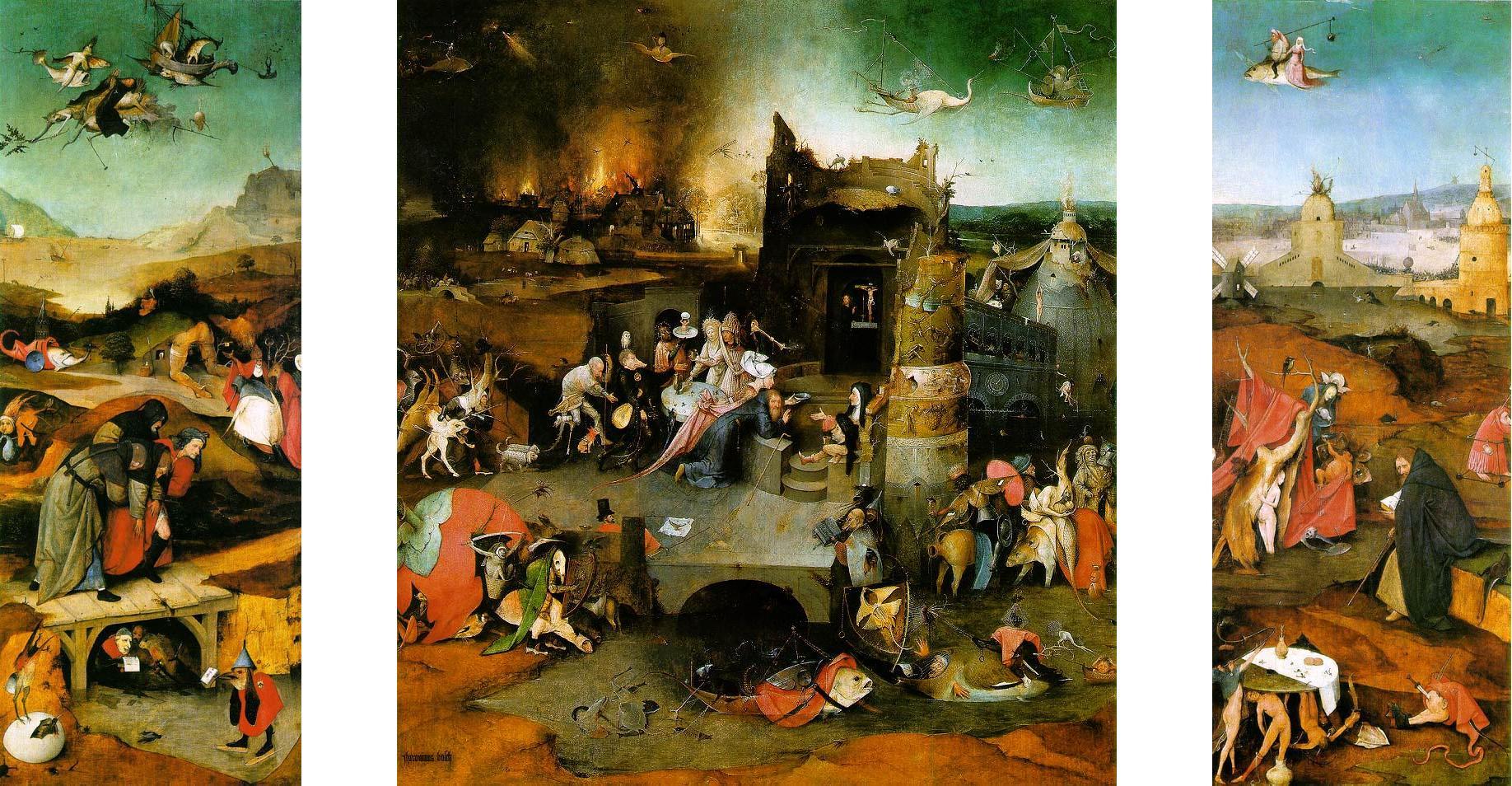
Book Notes : nasty, misogynistic, fearful contempt
 |
| page from The Essential Hieronymus Bosch |
from the little book The Essential Hieronymus Bosch by W. John Campbell (2000) p81 about the painting the Temptations of Saint Anthony :
Unlike the abstract theme of salvation through prayer in the middle panel, the right wing – like the left – is a narrative, the temptation of the saint by a beautiful girl. This misogynist episode – a nasty medieval expression of fearful contempt of women – pits the saint and his Bible against the allure of a slender nude in the hollow of a dead tree.
 |
| the Temptations of Saint Anthony triptych (right panel) by Hieronymus Bosch. (A complaint about misogyny and no one mentioned the phallic shaped top of the building in the upper right?) |
 |
| click to embiggen detail of the Temptations of Saint Anthony (right panel) by Hieronymus Bosch |
So, Saint Anthony being tempted by a plate full of gold coins is a gold-hating episode and a nasty medieval expression of fearful contempt of gold.
Is it misogynistic to suggest that many men can be tempted by a naked woman? Is it misogynistic to reject the advances of a naked woman? Or is it that she is naked? It must not be the temptation itself or it would be "biblical contempt" and not medieval contempt. Or is it misogynistic that she appears not to have feet (because she is standing in water)? Is the man and woman on a flying fish misogynistic too?
She appears to be covering herself with a crab. If she is infested with gigantic genital crabs then most men would be less tempted by her.
She appears to be covering herself with a crab. If she is infested with gigantic genital crabs then most men would be less tempted by her.
If the author intends "misogynist episode" to refer to Saint Anthony's rejection of the woman then the author has it wrong as I think she was actually the devil in disguise. A mis-diabolus-ist episode!
 |
| an attempt to show the scale of the painting |
Essential Hieronymus Bosch book review : As an aside, I bought the book on impulse and blindly online and it wasn't exactly what I was hoping for. It is physically small (about 6" x 6") and parts of it are written in a style that, I think, is intended to sound like a high school girl. Oddly, this casual style isn't consistent. It is as if an editor circled a few paragraphs and said "Hey, punch this up a little and make it sound cool and youthful. Y'know, hep and groovy like the kids talk these days. And be sure to mention a popular TV show so the readers know that we know what's on TV. And call something misogynistic because the whippersnappers are always doing that."
It isn't a very deep book. Many of Bosch's paintings have a great many elements in them and while the book may take a stab at explaining a couple things it then moves on to the next painting. For example, the painting The Seven Deadly Sins illustrates the 7 deadly sins. There is an overview of the painting and about basically one line illuminating what is going on in most scenes. Like "Greed (Avaricia), as a judge taking a bribe (sitting on a bench, as in a modern court, he extends his palm behind him in a gesture called a 'porter's tip')" I would point out that the judge in the painting is literally sitting on a long bench with 2 other people while a modern judge sits on an elevated platform behind a large desk – which is called the bench for historical reasons. No mention of the other 2 men in the painting, the wood in the body of water or the peculiar tree behind the judge or if any of those elements are significant.
Some barely lend any insight at all to the painting like "Gluttony (Gula), a common problem in a world of feast or famine," or "Lust or Excess (Luxuria), as a party in a tent that recalls medieval book illustrations for romance of courtly love" while I think most people might want to know if that is a monk spanking a jester's bare bottom? The answer isn't found in this book.
The blurb on the otherwise sparse back cover (there is only "bosch" in large letters, the UPC and the blurb) says "'Be an art expert in 5 minutes.' – The New York Times". The actual headline is "MAKING BOOKS; Be an Art Expert In Five Minutes!" and may involve sarcasm. The article itself says things like "At their worst (and perhaps at their best, too) the books provide art education through one-liners, sometimes with an attitude that, if not snide, is flip and condescending." Also from the NYTimes article is this bit of snobbery "…the words may be embarrassingly rudimentary at times…" The problem is the lack of information not the lack of polysyllabic words.
It isn't a very deep book. Many of Bosch's paintings have a great many elements in them and while the book may take a stab at explaining a couple things it then moves on to the next painting. For example, the painting The Seven Deadly Sins illustrates the 7 deadly sins. There is an overview of the painting and about basically one line illuminating what is going on in most scenes. Like "Greed (Avaricia), as a judge taking a bribe (sitting on a bench, as in a modern court, he extends his palm behind him in a gesture called a 'porter's tip')" I would point out that the judge in the painting is literally sitting on a long bench with 2 other people while a modern judge sits on an elevated platform behind a large desk – which is called the bench for historical reasons. No mention of the other 2 men in the painting, the wood in the body of water or the peculiar tree behind the judge or if any of those elements are significant.
Some barely lend any insight at all to the painting like "Gluttony (Gula), a common problem in a world of feast or famine," or "Lust or Excess (Luxuria), as a party in a tent that recalls medieval book illustrations for romance of courtly love" while I think most people might want to know if that is a monk spanking a jester's bare bottom? The answer isn't found in this book.
 |
| Hieronymus Bosch's Seven Deadly Sins detail of Lust "medieval book illustrations for romance of courtly love" = a man in robes spanking a man dressed like a rabbit? |
The blurb on the otherwise sparse back cover (there is only "bosch" in large letters, the UPC and the blurb) says "'Be an art expert in 5 minutes.' – The New York Times". The actual headline is "MAKING BOOKS; Be an Art Expert In Five Minutes!" and may involve sarcasm. The article itself says things like "At their worst (and perhaps at their best, too) the books provide art education through one-liners, sometimes with an attitude that, if not snide, is flip and condescending." Also from the NYTimes article is this bit of snobbery "…the words may be embarrassingly rudimentary at times…" The problem is the lack of information not the lack of polysyllabic words.
Saturday, August 3, 2013
Venus and Psyche
 |
| click to embiggen |
Red chalk, 26.3 x 19.7cm
Louvre, Paris, France inventory number 3875
This drawing was used by Raphael as a study for his fresco showing Venus and Psyche at Villa Farnesina (although some have attributed the drawing to Giulio Romano, pupil of Raphael) and eventually it was bought for the Royal Collection of Louis XVI.
 |
| click to embiggen |
Venus and Psyche by Raphael (Raffaelo Santi), 1517-1518
fresco, size unknown
Villa Farnesina, Trastevere district, Rome, Italy
At the Louvre, the Raphael drawing was copied by Edgar Degas and later Paul Cézanne. Interestingly, both chose to copy many of the same figure drawings. But in this case they're purposes were not the same : Degas carefully copied the lines, line weights, hatching, shadows, and form (even drawing the container and Psyche's head transparent because that is how Raphael did it) to understand how it was done while I think Cézanne drew the pose as as if he were in front of live model.
 |
| click to embiggen |
graphite, 11.375 x 8.25" (29 x 21 cm)
private collection
 |
| click to embiggen |
graphite, 9.5 x 6.75" (24 x 17cm)
private collection
 |
| an attempt to show the size and scale of the drawings |
Tuesday, July 30, 2013
Monday, July 29, 2013
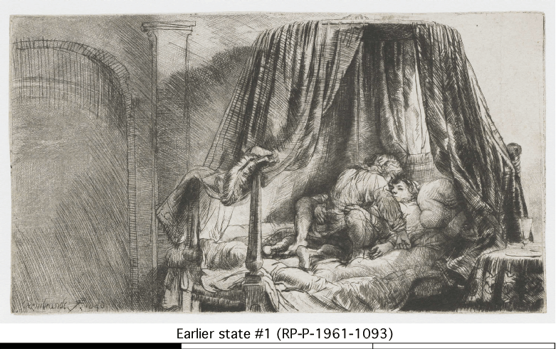
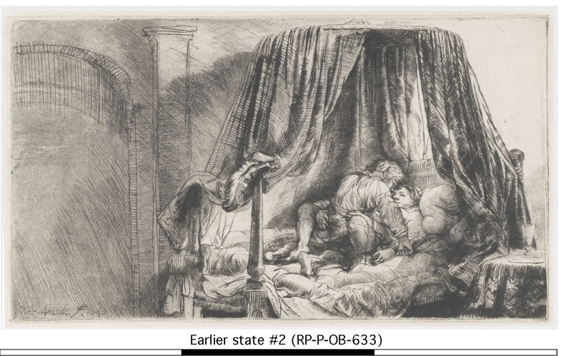
Mutants need love too
 |
| Rembrandt's Ledikant |
etching, height 125mmx width 224 mm
The subject matter is pretty unambiguous to most people. The book Rembrandt and His Work (1899) describes it as "A very rare plate, which need not be described". The dutch genre was apparently called "boelering" which is dutch for "cohabitation." Rembrandt was 40 years old at the time so I would suggest he qualifies as a dirty old man.
Both sixes in the date are printed backwards. That is to say they were not etched onto the plate backwards.
There are several different states to the etching. With each revision was it unnoticed that she has 3 hands (one right and 2 left hands)? Assuming, she doesn't have 4 arms and that the second right hand simply isn't shown. Or maybe the intent was to imply a kind of motion.
From a Descriptive Catalogue of the Prints of Rembrandt (1836) :
First impression There is a margin at top and the plate measures 6 in by 8.9 in
At the bottom of the door leading from the recess is written Rembrandt f 1646
Second impression The margin is cut off it is extremely rare and measures 5 in by 8.9 in
There is much of the bur in this impression
Third impression It is very scarce the recess and door with the name are cut off it measures 5 in by 6.9 in
It has been suggested that the final state was trimmed out of shame to take off Rembrandt's name.
The British Museum says there are at least 4 states to the plate. The Rijksmusuem possesses at least 3 different states of the print :
- RP-P-1961-1093
- RP-P-OB-633
- man's arm burnished
- add a bit of smile to the woman's face
- (animation showing the differences between RP-P-1961-1093 and RP-P-OB-633)
- RP-P-1961-1092
- darkened the leftmost bedpost
- crosshatching on the side table
- add shadow of the plate on table
- altered the bedding hanging down
- refined the curtain rod
- (This is the image shown at the top of the post. Animation showing the differences between RP-P-OB-633 and RP-P-1961-1092. Or an animation comparing all three).
 |
| an attempt to show the size and scale of the etching |
Tuesday, July 16, 2013
Painting in a painting : Vermeer
 |
| somebody's Last Judgement (detail of Vermeer's Woman Holding a Balance ) |
The source of this Last Judgement painting is unknown. It isn't bad.
 |
| the full painting Vermeer's Woman Holding a Balance oil on canvas, 15.875" x 14" c1662-1665 |
 |
| an attempt to show the size and scale of the painting |
Saturday, July 13, 2013
Schuttersfeest by Meester van Frankfurt

Schuttersfeest (Festival of the Archers) by Meester van Frankfurt, 1493
oil on canvas, height 176cm x width 141cm
Koninklijk Museum voor Schone Kunsten Antwerpen, Antwerp, Belgium
The Artist
In the lower right quadrant is a man and a woman in white holding a dog : he is the artist. The Master of Frankfurt (aka Meester van Frankfurt)
 |
| The artist and his wife and her dog. |
 |
| Did he wear the exact same clothes every day? |
drummer
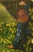
What's a black guy doing in the Hapsburg Netherlands (and what would eventually be Antwerp, Belgium)?
 |
| sure, give the black guy the flesh colored tights |
The jesters
The jester in red & black appears to be wearing roller skates. The link above notes that the small white line going from the bird on the red & black jester's should to the eye of the jester in green Shrek hat might look like a scratch on the painting but it is not. It is paint showing the black bird bending down, lifting his tail feathers and spraying poop into the eye of the green jester.

Hey, look over there…
 |
| "Hey, baby, I really like your apples…" |
Getting frisky
 |
| K - I - S - S - I - N - G |
 |
| she is squeezing his thigh and looking at him with lust in her eyes |
Saint George
 |
| A statue of a knight in armor with a lance (Saint George?) and a banner bearing the cross of Saint George (from the upper left corner of the picture) |
Schuttersstuk
This is not typical of the schuttersstuk genre. The usual schuttersstuk focuses almost exclusively on the portraits of the militia members. In this, it is difficult to tell who is a militia member and who is not. They are probably the men with an insignia on their arm, those holding bows and who knows who else.
In common with other schuttersstuk, it was apparently commissioned by the Antwerp Crossbow Guild. The dutch wiki page describes the painting as allegorical but I haven't seen an explanation of the meaning.
 |
| a member of the militia, a heavy drinker, with an insignia on his arm carrying heavy drink containers. |
Scale
 |
| an attempt to show the size and scale of the painting |
Subscribe to:
Posts (Atom)
