Showing posts with label plagiarism. Show all posts

Sunday, October 1, 2023

Art as a Creative Endeavor : Norman Rockwell


Art Critic by Norman Rockwell, 1955


I think understanding the sources makes the Rockwell more entertaining. They aren't simply made from imagination but are slight modifications of existing art. 

To the left is Portrait of Isabella Brant by Peter Paul Reubens, c1620–1625
Portrait of Isabella Brant by Peter Paul Reubens, c1620–1625

To the right is Banquet of the Officers of the Saint Joris Doelen by Frans Hals, 1616
Banquet of the Officers of the Saint George Militia (Banket van de officieren van de Sint-Joris-Doelen) by Frans Hals, 1616


Saturday, April 8, 2017

Art as a Creative Endeavor : Andy Warhol's Prince

Seen here


photograph of Prince, 1981 by Lynn Goldsmith
(I couldn't find a clean copy of the photo –this one is close –so this is taken from the lawsuit against the photographer by the Andy Warhol Foundation hence the oval around the eyes)


Prince by Andy Warhol, 1984

animated gif below the fold

Tuesday, November 29, 2016

Art as a Creative Endeavor : Norman Rockwell vs Michelangelo

Not plagiarism, exactly, but more of an homage.


Sistine Chapel, Prophet Isaiah by Michelangelo, circa 1542-1545

Rosie the Riveter by Norman Rockwell, 1943
Note that Norman Rockwell's picture includes a halo.

an animated gif comparing them below the fold.

Wednesday, November 16, 2016

Art as a Creative Endeavor : Caravaggio vs Rubens

The Entombment of Christ by Caravaggio, 1602-04

The Entombment of Christ by Peter Paul Rubens, 1612-1614

Peter Paul Rubens painted the altarpiece for the same church, Santa Maria in Vallicella in Rome, that hired Caravaggio to produce the chapel painting "The Entombment of Christ." He must have seen Caravaggio's work and been impressed. Or he thought he could improve it.

Interesting how faithful Rubens copies parts of Caravaggio's work but he also dramatically changes the composition. The man at the left in red (John the Evangelist) is moved significantly in pose and in position although his hand remains positioned on Christ's wound. The head of Christ is changed, as is the head of Nicodemus, holding Christ's legs. The hair of both have changed. The Italian Caravaggio had given them black hair while the Flemish Rubens gave them lighter hair I would guess to make it more relatable to the local audience or more relatable to himself. The color of Nicodemus' clothes is also changed.

The stone slab is more unfinished and painterly in Rubens' version. Rubens omits the plant at lower left.

Rubens also omits the woman with her arms upraised (Mary of Cleophas) probably because when people look at Caravaggio's version they connect her with the stout man legs below her belonging to Nicodemus. Mary Magdalene with her hand to her head and her head down is modified only slightly. The older woman would be the Virgin Mary which Rubens changed radically and added another woman beside her. Personally I like Caravaggio's Virgin Mary and Mary Magdalene in parallel next to each other with their heads bowed down together like a visual stutter.

Rubens painted several variations of the subject, perhaps the subject for future post.

As a bonus, Caravaggio's entombment of Christ as drawn by Paul Cezanne
The Entombment of Christ by Paul Cezanne

An attempt to show the scale of the paintings. The Caravaggio appears larger than life size.

below the fold is an animated gif comparing them

Friday, November 11, 2016

Art as a Creative Endeavor : Adolf Hitler

The pictures of Adolf Hitler's watercolor paintings are from the TV show "Bright Lights, Brilliant Minds : A Tale of 3 Cities" (2014) Season 1 Episode 1 "Vienna 1908" from BBC Four. The show covers three cities at particular times and their creative output.

First let me mention how annoying this presenter is. Dr. James Fox (not to be confused with the black Jamie Foxx)  is a total ham and makes a variety of assertions which he states with confidence but usually doesn't back them up.

Adolf Hitler spent 1905 to 1913 in Vienna, Austria as an aspiring artist. Below are the 3 examples of Hitler's work shown. I suggest that one of them might have been drawn from a photograph and that the other two were almost certainly drawn using a photographic reference.

St Charles Church (Karlskirche), Vienna watercolor by Adolf Hitler

The two columns are not parallel and they aren't the same height. The columns lean away from one another. The perspective of the capital at the top of the columns looks about correct but the top of the column on the left was drawn too high so it doesn't quite look right. When drawing from a photo sometimes the focus on copying means you miss the position of the details within the whole.


Austrian Parliament (Österreichisches Parlament) building watercolor by Adolph Hitler
in the background at center left is the Votivekirche church spires and to the right is the Burgtheater.

The first thing is the bird's eye perspective. It is possible that he went across the street from the parliament and drew it from the 3rd or 4th floor of the building across the street but it is doubtful.

This picture postcard of the Austrian Parliament and the drawing are very, very similar.  

photograph of the Austrian Parliament dated 1906

Now just because the perspective is the same doesn't mean he copied it from the photo. He could have coincidentally chosen the same viewpoint as the photographer. It could just be a coincidence that he included nothing outside of the boundaries of the photograph. He may have even chosen essentially the same composition. But would he have coincidentally included pedestrians (and a streetcar) in nearly the exact same places as in the photograph? 


But the third shown is the coup de grâce.
Vienna National Theater watercolor by Adolph Hitler
The presenter says about this :
"It's not hard to see why Hitler didn't get in [to the Vienna art school]. When you compare him with his contemporaries his quaint pictures of Vienna's historic landmarks seem embarrassingly old fashioned. This is a typical watercolor by Adolph Hitler. I'm slightly pained to admit that its not that bad. There is plenty of precise architectural detail, there is some evidence of perspective and actually his handling of the paint brush is quite confident. But you know what I find so interesting about it? This building, the National Theater, didn't even exist. In fact it had been demolished 20 years before Hitler even arrived in Vienna. But that's because Hitler was painting Vienna a hundred years out of date. A harmonious and eternal Vienna, the city that would never die."

This is what I mean by him making assertions and then failing to back them up. Did Hitler draw the building because it was an essential element of eternal Vienna or what I think is far more likely : he drew the building because that is what his reference photo showed. And if it had been demolished years before he arrived in Vienna how would he know it was part of eternal Vienna and how could he have included precise architectural detail of a building he had never seen.

If you didn't dislike Hitler before you should now that I've shown he was a cheater; a mere copyist and tinter of photographs taken by other people.

Sunday, November 6, 2016

Art as a Creative Endeavor : Edward Burne-Jones

Phyllis and Demophoon by Edward Burne-Jones, 1870
watercolor on paper,  93.8 x 47.5 cm (36.9 x 18.7 in)

The Tree of Forgiveness by Edward Burne-Jones, 1882
oil on canvas, 190.5 × 106.7 cm (75 × 42 in)

In 1870, Edward Burne-Jones exhibited Phyllis and Demophoon
Phyllis, Queen of Thrace, falls in love with Demophoon, son of Theseus. He departs but promises to return in six months' time. When he fails to keep his promise, Phyllis hangs herself, and is turned by the gods into an almond tree. On his eventual return, Demophoon remorsefully embraces the tree, which blooms, as Phyllis emerges to forgive and reclaim her faithless lover.
Both Phyllis and Demophoon are modelled on Maria Zambaco, with whom Burne-Jones had been having an affair since June 1868 (a host of studies exist for both figures, in various locales). And for this reason, in conjunction with Demophoon's nudity, a controversy ensued when it was exhibited at the Old Watercolour Society for the Summer Exhibition of 1870. Within two weeks of the exhibition's opening, Burne-Jones withdrew the painting due to complaints, and two works by other artists were exhibited in its place. In August 1870, Burne-Jones resigned from the Society, over artistic integrity.
In the catalogue for the Summer Exhibition at the Old Watercolour Society, Burne-Jones included the following caption, a quote from Ovid: 'Dic mihi quid feci? Nisi non sapienter amavi' [Tell me what I have done? I loved unwisely.] Burne-Jones later reworked the painting entirely in oils, transforming the bodies of both Phyllis and Demophoon into an homage to Michelangelo, calling it 'The Tree of Forgiveness' (1882, Lady Lever Art Gallery, Port Sunlight), where Zambaco's face remains only on Phyllis.

The Tree of Forgiveness, 12 years later,  is about life sized. The figures are not identical to the previous version but they are remarkably similar and the concept is the identical. The colors are different. in the 1870 painting Demophoon looks slight and ashen.

The drapery in Phyllis and Demophoon covered Phyllis' body along with her arm covering her breast and the magical drapery wrapped itself around Demophoon's leg without providing him any modesty (modesty in the sense of avoiding impropriety or indecency but modest in the sense of "a small amount" could be used to describe him). In contrast, in The Tree of Forgiveness magical drapery covers his manhood and flowingly wraps around his leg and only his leg while she is exposed fully nude.

It is interesting that Michelangelo depicted women by drawing men and the "feminizing" them and Burne-Jones in Phyllis and Demophoon drew a woman and then "masculinized" the figure.


An attempt to show the scale of the pictures.

below the fold is an animated gif contrasting the two.

Saturday, July 4, 2015

Art as a Creative Endeavor : EJ Sullivan vs Stanley Mouse & the Grateful Dead


Edmund J. Sullivan illustration to the Rubaiyat of Omar Khayyam (1913) vs Stanley Mouse's Grateful Dead poster (1966)
Edmund J. Sullivan illustration to the Rubaiyat of Omar Khayyam (1913)
Stanley Mouse's Grateful Dead poster (1966)


Grateful Dead 1971 double album with cover opened


In 1966 Kelley and I were in the San Francisco public library looking for inspiration for a poster we were doing for the Grateful Dead. We stumbled upon an illustration in the Rubaiyat of Omar Khayyam, a twelfth-century Arabian work of poetry. Kelley said, “ Is that the Grateful Dead or is that the Grateful Dead!?” I responded, “that’s got Grateful Dead written all over it!”
Maybe everyone else knew about this but I had assumed they did more than just make a photocopy of someone else's illustration, add a frame, lettering and color (the poster) or take the photocopy add a art nouveau frame, lettering and color (the album)

Monday, May 4, 2015

Deconstructing Roy Lichtenstein


Roy Lichtenstein became famous making large versions of comic book panels.
David Barsalou went to the trouble to discover who Roy Lichtenstein was copying.


wiki says :
Favoring the comic strip as his main inspiration, Lichtenstein produced hard-edged, precise compositions that documented while it parodied often in a tongue-in-cheek humorous manner. His work was heavily influenced by both popular advertising and the comic book style. 


Frankly, some of his "precise compositions" were composed by someone else.


Lichtenstein didn't always make exact copies of the source drawings, but in my opinion, even when he did make copies he tended to make the drawings worse.


(animated GIF comparison of Lichtenstein's In the Car to the original image below the fold)

Wednesday, November 6, 2013

Art as a Creative Endeavor : Ingres vs Romans

JAD Ingres painted 2 portraits of Madame Moitessier (born Marie-Clotilde-Inès de Foucauld). The first one he started working on is the seated portrait below. It was commissioned in 1844, drawn onto the canvas by 1847 but not completed until January of 1857.

The second (or the first one completed) was started and finished in 1851 and is the portrait of her standing which is now at the US National Gallery of Art and mentioned previously.


.portrait of Madame Moitessier by JAD Ingres
click to embiggen
Portrait of Madame Moitessier Seated by Jean-Auguste-Dominique Ingres, 1851
oil on canvas, 120 cm × 92 cm (47 in × 36 in), British National Gallery, London, UK


Roman Fresco of Hercules and Telephus from the ruins of Herculaneum, 1st century AD

Roman fresco of Hercules and Telephus from Herculaneum which influenced the portrait of Madame Moitessier by JAD Ingres
Roman Fresco of Hercules and Telephus in color (Telephus is Hercules' son and is being suckled by the doe in bottom left) "Herakles Finding His Son Telephus"
79.5 x 63.375 in, Musei Nazionale, Naples, Italy
Ingres' original concept was to include Moitessier's daughter in the painting. However, the child did not sit well and progress on the painting took years. One wonders, would she have been the child behind the sitting woman (the pan flute makes me think it might be a satyr) or the child suckling a deer?

study for the seated portrait of Madame Moitessier by JAD Ingres
Study for the Portrait of Madame Moitessier Seated by Jean-Auguste-Dominique Ingres superimposed on the painting, c1846-48, graphite on paper 6.375 x 4.625 inches (16.2 x 11.8 cm)
The pencil drawing above superimposed onto the painting shows the oval head of Mme Moitessier's daughter, Clotilde-Marie-Catherine who was born March 19, 1843. That means at the time of the commission Clotilde was one year old, at the time of the pencil drawing she was 3 to 5 years old, and at the time of completion little Clotilde was nearly 14. The pose of the small child would be less suitable for a teenager.

Also worth noting is the second portrait in profile in the sitting portrait. It is ostensibly reflected in the mirror but to get that reflection the mirror would have to at a different angle instead of flush on the wall.

detail of the right hand in the portrait of Madame Moitessier by JAD Ingres
detail of the swollen octopus like hand
an attempt to show the scale of the 2 portraits of Madame Paul-Sigisbert Moitessier, née Marie-Clotilde-Inès de Foucauld, sitting and standing painted by JAD Ingres
an attempt to show the scale of the paintings

Tuesday, December 4, 2012

What, Me Worry?

An Alfred E. Newman lookalike asking me worry? with a handwritten note.

An Alfred E. Neuman lookalike asking "Me worry?" with a handwritten note comparing the recipient to the goofball on the postcard. The postcard predates Alfred E. Neuman and Mad Magazine by decades.

Saturday, October 20, 2012

nearly plagiarism

Supposedly, an Assyrian Battering Ram

A Dalek … or is it an Assyrian battering ram?


barely related :


Friday, February 18, 2011

Four Spaniards

First : Diego Velazquez's Las Meninas (1656). The original.
Diego Velazquez's Las Meninas
click to embiggen


Second : Francisco Goya's etching Las Meninas (c. 1778) after Velazquez. Note it is the only one here that kept the original's proportions.
Goya's etching after Las Meninas by Velazquez
click to embiggen


Third : Salvador Dali's Infanta Margarita from Velazquez's Las Meninas (1981, titled "The Pearl".
Salvador Dali's The Pearl after Diego Velazquez's Las Meninas
click to embiggen


Fourth : Pablo Picasso's Las Meninas (1957, Picasso did dozens of paintings after Velazquez's Las Meninas)
after Diego Velazquez's Las Meninas
click to embiggen


after Diego Velazquez's Las Meninas
click to embiggen


Diego Velazquez's Las Meninas
click to embiggen

Wednesday, February 9, 2011

Stylistic plagarist : Claude Monet

A previous stylistic plagarist has been noted.

Cattle Going to Work - Impression of Morning by Constant Troyon (1855)
click to embiggen

Cattle Going to Work - Impression of Morning by Constant Troyon (1855)

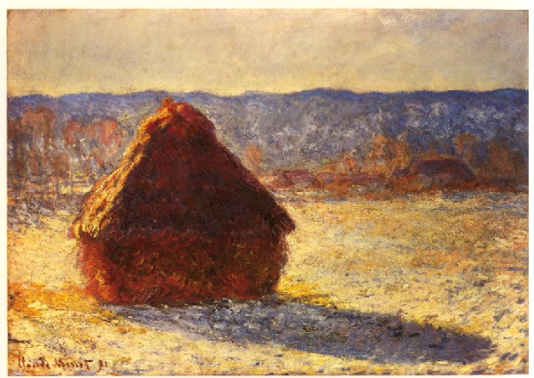
Claude Monet - Haystack Morning Snow Effect (1891)
click to embiggen

Haystack Morning Snow Effect by Claude Monet (1891)

Around 1859, at 19, Claude Monet, with a letter of introduction from the painter Eugène Boudin, met Troyon and supposedly asked to be his student but the self-taught Troyon declined.

Of course, calling it plagiarism is a stretch. One difference is the size. Troyon's painting is huge. 102.25 x157.5 inches. Monet also did large paintings but I think his larger paintings are the water lilies and his more conventional landscapes are of a more conventional size. I could be wrong. The other difference is that Troyon was never as impressionistic as Monet but my first reaction to Cattle Going to Work reproduced in a book was "Ah, a Monet?"

Saturday, February 5, 2011

stylistic plagiarism

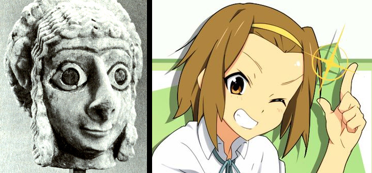
Sumerian head from c.2500 B.C. vs Random anime head from about 4500 years later
Sumerian head vs random anime character : Ritsu Tainaka
click to embiggen


I'm working on a theme.

Monday, August 16, 2010

Robert Crumb's biological father?

Coney Island by Paul Cadmus
click to embiggen

Coney Island by Paul Cadmus (1904-1999) painted in 1934

Cheap Thrills album by Janis Joplin with cover art by Robert Crumb
Robert Crumb (born 1943)

Thursday, January 29, 2009

Art as a Creative Endeavor : Francesco Primaticco vs Niccolo dell' Abbate

the painting Ulysses and Penelope c1560 by Francesco Primaticco - a look at artistic plagarism
Ulysses and Penelope by Francesco Primaticco


the painting Venus and Cupid by Niccolo dell' Abbate - a look at artistic plagarism
Venus and Cupid by Niccolo dell' Abbate


Or maybe not that creative.

I suspect that "Ulysses and Penelope" is the original and "Venus and Cupid" is the facsimile for the following reasons :

  1. Ulysses touching Penelope's face looks romantic but Cupid's hand looks like he is waiting for her to spit out a quarter.
  2. Cupid has a mullet.
  3. Unlike Penelope who appears to be fidgeting with her hands, Venus appears to be making a rude gesture with an erect thumb on one hand between two open fingers on the other.