Showing posts with label propaganda. Show all posts

Tuesday, March 17, 2026

Paul Ehrlich & the Population Bomb : professional optimists


from the Population Bomb by Dr. Paul R. Ehrlich, twelfth printing, Feb 1970, page 26-27
There are some professional optimists around who like to greet every sign of dropping birth rates with wild pronouncements about the end of the population explosion. They are a little like a person who, after a low temperature of five below zero on December 21, interperts a low of only three below on December 22 as a cheery sign of approaching spring. First of all, birth rates show short-term fluctuations caused by many factors. For instance, the birth rates depends rather heavily on the number of women at reproductive age. In the United States the current low birth rates soon will be replaced by higher rates as more post World War II "baby boom" children move into their reproductive years. In Japan, 1966, the Year of the Fire Horse, there was a year of very low birth rates. There is widespread belief that girls born in the Year of the Fire Horse make poor wives, and Japanese couples try to avoid giving birth in that year because they are afraid of having daughters.
He presents Japan's birthrate drop in 1966 as an example of a sign used by "professional optimists [although he labels them with a term of disparagement he doesn't name anyone] around who like to greet every sign of dropping birth rates with wild pronouncements about the end of the population explosion"

Let's deconstruct :

  • start with a strawman argument that "greet every sign of dropping birth rates with wild pronouncements about the end of the population explosion"
  • don't mention anyone who believe this
  • derisively refer to the anonymous believers as "professional optimists"
  • make an analogy to the passage of seasons to suggest it is cyclical (Does that imply that people having large families was also cylical?)
  • declare that high birthrates will return in the US
  • cite Japan in 1966 as an example of short term fluctuations in birth ratres
  • imply that Japan will also return to high birth rates 


"In the United States the current low birth rates soon will be replaced by higher rates as more post World War II "baby boom" children move into their reproductive years." Let's see what happened :

United States birthrate 1900-2010
the red line denotes the Baby Boom (source)

US Total Fertility Rate
The red line shows a replacement rate of 2.1. (source)


Ehrlich is correct that Japan's birth rate dropped in 1966.


Japanese Birthrate 1900-2010
(source)


Japanese Total Fertility Rate 1925-2010
The red line shows a replacement rate of 2.1.
(source excel)
Japan was below the replacement rate from 1960-1964, above in 1965 (in anticipation of year of the fire horse), below in 1966 (year of the fire horse), above 1967-1973 and below in the following 37 years. Of the 50 years from 1960-2010, 8 are slightly above the replacement rate (peaking at 2.23 in 1967) while 42 are below the replacement rate.

1966 Japan is an example of "short-term fluctuations" in birthrates but somehow Ehrlich forgot to  mention that Japan's birthrate had for several years been below the replacement rate. It doesn't take a "professional optimist" to see Japan's birthrate dropping and come to the conclusion that Japan's population explosion has ended. 

Ehrlich was just another propagandist who would identify an issue and then declare some centralized control must be enforced. 

(note: a post written in 2016 but never posted, but I was reminded of it by Ehrlich's death)

Paul Ehrlich & the Population Bomb : 70 million hungry people


 “By the year 2000 the United Kingdom will be simply a small group of impoverished islands, inhabited by some 70 million hungry people ... If I were a gambler, I would take even money that England will not exist in the year 2000.” 
–Paul Ehrlich, Speech at British Institute For Biology, September 1971. (note that the quote by Ehrlich is not from the book)


Everyone panic! Wiki says the UK's population was 58,789,194 in 2001 but Ehrlich's prediction was 70 million hungry people. The mass starvation must have already begun! 

the UK population estimate for 2024 is 69,281,437.  

Paul Ehrlich & the Population Bomb : The Paul Ehrlich Method for Picking Up Chicks

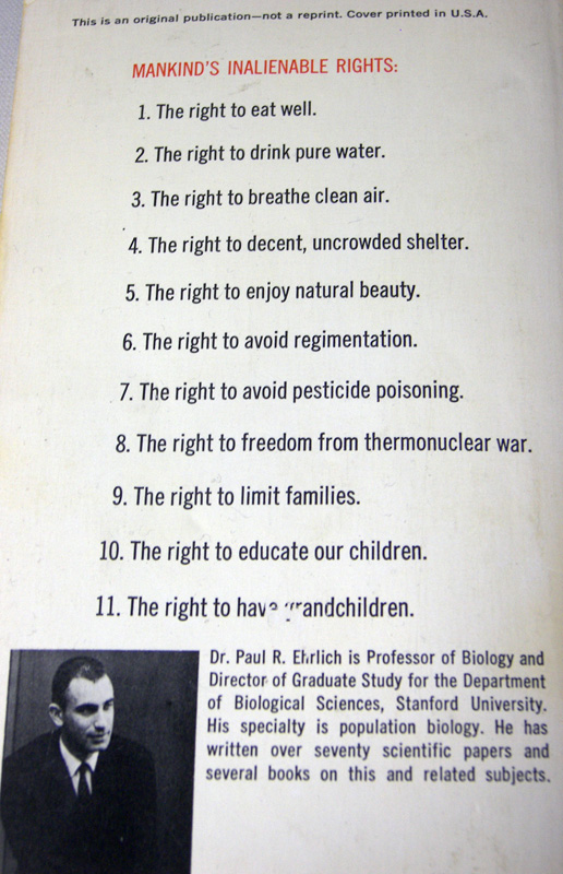
the back cover of the Population Bomb 


The Paul Ehrlich Method for Picking Up Chicks is based on an assertion made on the back cover of The Population Bomb by Paul R. Ehrlich. Take careful note of inalienable right #11 : “The right to have grandchildren.”

What you need : the book the Population Bomb, a girl

How it works : 

Step 1 : find a girl, approach her and get her mother’s phone number
Step 2 : convince her mother how awesome you are and why you would make a great father
Step 3 : explain to the girl in step one that while it is unfortunate that her mother’s positive right to grandchildren infringes on her right to make her own decisions it remains that this (hold up book and wave it about) says her mother has “the right to have grandchildren” and the decision has been made so the daughter has a duty to oblige or else she will be violating her mother’s rights.
Step 4 : profit

Go ahead and try it : no guarantees are offered or implied.

Also note inalienable right #6 : “The right to avoid regimentation” From a book whose main message is shut up and be controlled. Here is the full list of asserted rights on the back cover.

(inside the book, a list of rights is given to be used as a response to anyone who claims individuals should have the right to decide how many children they have. The idea is that multiple rights (to grandchildren, to enjoy natural beauty etc) by sheer numbers outweigh any single right. I’d also say it is intended to devalue the idea of rights.)

Sunday, February 25, 2018

Propaganda posters from the Spanish Civil War #3 : a contrast or a consensus?

(this is the third installment; the first group of propaganda posters from the Spanish Civil War is here and the second, focusing on depictions of Franco, is here)


the Government's leash hand
Izquierda Republicana Junta Municipal Valencia
Gobierno. 
Obediencia ciega hasta ganar la guerra.
Orden Publico
Agricultura
Transporte
Industrias de Guerra
Ejercito
El que trate de mermar dicha autoridad es un traidor y a estos hay que exterminarlos.

Left Republican Municipal Council Valencia.
Government. Obedience blind until winning the war.
Public Order
Agriculture
Transport
War Industries
Army
The one who tries to reduce that authority is a traitor and these must be exterminated.


-----------------

It is surprising how much the Republican side and the Nationalist side agree. The above poster calls for the extermination for those who are not blindly obedient to the government and the poster below agrees : communism leads to extermination


communism leads to extermination : for some it is a bug for some it is a feature
"Lo Que Hay... ...Detrás del comunismo"
What there is ... ....behind Communism


-----------------

(scene : interior of a Valencian poster design office)
Valencian #1 : "Let's portray the government as a giant who can guide people into working together."
Valencian #2 : "Well, we should also stress the consequences of not working together."
Valencian #1 : "Let's portray the government as a giant who is psychopathically violent at anything less than cooperation." 
Valencian #2 : "but what about disagreement or questioning or people making suggestions?"
Valencian #1 : "Okay....Let's make it a giant who is psychopathically violent at anything less than blind obedience."
Valencian #2 : "*sigh* Cold blooded murder is awesome! I want to marry that giant! But shouldn't we portray the purpose of the government?"
Valencian #1 :  "Good thinking! We'll portray the government as a giant who is psychopathically violent at anything less than blind obedience and he keeps people on leashes." 
Valencian #2 : "Who wouldn't admire a government like that"


Sunday, October 8, 2017

Propaganda posters from the Spanish Civil War #2 : Franco

(this is the second installment; the first group of propaganda posters from the Spanish Civil War is here)


Franco found here 
by J. Davó (signed at lower left) and printed by the Romero Lithograph (Tenerife, Canary Islands). Excellent use of a limited number of colors.

A smiling Franco, atop a white horse leads 2 columns of supporters. Those on the left carry the red and yellow pre-republic, red and yellow civil ensign Spanish flag (or the royalist flag if a crest is hidden in the fold). The column on the right carries the red and black flag of the Falange. Franco and his horse complete the cross.  "Julio 18, 1936" refers to the date of the beginning of the Spanish Civil War. The rays behind the cross evoke a dawn.

Franco's horse steps on a red snake, a traditional symbol of evil, holding a hammer and sickle in its mouth. The symbols of the hammer and sickle were used by some political parties of the Republican Left.

Not to be cruel, but Franco was not a particularly handsome man and yet here he is drawn in a remarkably flattering way while retaining his likeness. Contrast it to the painting below by Paco Ibera. Franco is as reality would have him : balding, bags under his eyes and a rounded chin (disguising a double chin that can be seen in the photo of Franco later in the page.

----------------
Dictator in Furs by Paco Ibera
This was previously mentioned here. Go to that link for more commentary on this.

----------------

"Franco cut off at the knees" may not have been the creator's intent

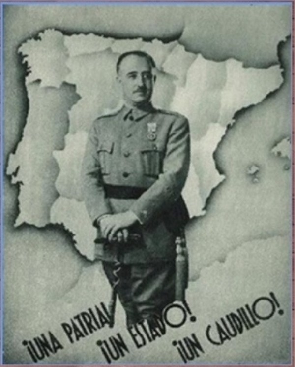
Una Patria! Un Estado! Un Caudillo! (One fatherland! One state! One strongman!)

I suspect this is not from the Spanish Civil War but afterwards.  Cropping Franco off at the knees making him look like Dorf the Dictator. I find it interesting that while there is a relatively bright contrast between the Spanish-French border there is less contrast between the Portugese-Spanish border – it is only slightly more pronounced than the internal borders. Franco presents him self simply : a lack of epaulets or furs or rows of medals.

The font seems very 1930s.

----------------

The next portray Franco is a less flattering way.
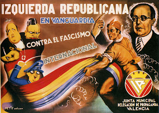
 Izquierda Republicana En Vanguardia Contra El Fascismo Internacional (Left Republican in vanguard against international fascism) by Petit Guillén Carteles  de la Republica y de la Guerra Civil #180
Left Republican in vanguard against international fascism! (Seriously, you would think they would have included an exclamation point or 2)

Izquierda Republicana En Vanguardia Contra El Fascismo Internacional (Left Republican in vanguard against international fascism) by Petit Guillén (signed at lower left)

from the upper left is Jose Maria Gil Robles (with a pear for a head and bald except for a stem on top) he wears a Sacred Heart necklace to note his Catholicism. Next to him is Benito Mussolini wearing a tiny hat. Below Gil Robles is Adolph Hitler looking sad with his head cocked horizontal.
from left to right : Gil Robles (no stem on top), Francisco Franco and unknown.

Below Hitler is a short, cartoony, Chaplinesque Francisco Franco with a swastika and a death's head on his hat and a sword in his raised hand.

They are all wrapped in the Spanish Republican flag (red, yellow and purple) being pulled by a Republican soldier. While Mussolini, Hitler and Gil Robles are bound together, Franco only has the flag wrapped on one side and he holds a sword that can probably cut fabric.

To the right, behind the soldier, and at the far right is Manual Azaña and his awkward, wrongly drawn hand and pointy finger gesturing upwards. Unlike Franco in the first image, I think here Azana looks little better than reality.

photograph of Manual Azaña (note that the artist wasn't exceptionally unflattering it is just that Manual Azaña looked like a muppet in real life.)

Surrounding Azaña is a crosshatch of white.  Part of the problem likely being those on the left (of the poster) were drawn by a skillful cartoonist while Azaña was likely drawn by the cartoonist copying a photograph and trying to draw realistically while his real talents line in his skill as a cartoonist.

At lower right is a logo "Junta Municipal Delegation de Propaganda Valencia" (Municipal Board Delegation of Propaganda Valencia) (as an aside it is a nice font)

A striking contrast in styles; cartoony for the villains and realistic for the politician and idealized for the Republican soldier.

----------------

el generalisimo by Pedero Carteles de la Republica y la Guerra Civil #551
el generalisimo by Pedrero (signed at lower left)

#551 in Carteles de la Republica Y la Guerra Civil
Junta Delegada de Defensa de Madrid

I imagine that  the title "el generalisimo" in all lower case was intended to be diminishing towards someone grandiose enough to call himself "el generalisimo."

Francisco Franco as death himself dressed in a long grey coat, a black and red cape, white gloves, and spurs. His hand on his sword and his cape carried by an obese army general, an obese capitalist and an obese friar toting a rifle. Again, Franco is shown wearing a swastika.

The helmet is more like a Prussian/German pickelhaube than a contemporary Spanish army helmet (at least as far as i've seen. In fact, while I've browsed through many photos from the Spanish Civil War the only helmets I've seen are on the Republican side. The overseas cap seems to have been worn on the Nationalist side.) Franco's white gloves remind me of the white gloves a plethora of animated cartoon characters like Mickey Mouse wear.

----------------

el generalisimo by Antonio Cañavate Carteles de la Republica Y la Guerra Civil #552
el generalisimo by Antonio Cañavate (signed)
I.E. el generalisimo
Junta Delegada de defensa de Madrid
Rivadeneyra, UGT  Madrid

I think this is the most effective. It is fun, interesting and harshly mocking. Francisco Franco on his My Little Pony (with a swastika brand). The chubby horse smiles at a butterfly as it rears up while striking a coy David-esque pose.
Napoleon Crossing the Alps by Jacques Louis David, 1801

Franco's chest is puffed out and he holds a wooden club (one of the knots is heart shaped). He wears an extravagant uniform complete with epaulets, a sash, side stripe pants, a hat with different colored feathers,He has a colorful horse blanket and a blunderbuss (outdated for a 100 years). I'm not sure why his skin is orange, perhaps to comment on his tan from his years in Morocco and the Canaries.

From the swirling clouds drop 2 bombs. The cactus in the background is made up of faces.

It is interesting that the swastika is attached to Franco by his opponents but Franco did not use it as a symbol used to represent the Nationalists. The symbol used by Franco is the old national flag - horizontal red, yellow, red stripes or the red and black Falange symbol and, of course, he used himself as a symbol.

In contrast, elements of the Spanish left also freely adopted the hammer & sickle for themselves (in particular : the PCE, Partido Comunista de Espana aka the Spanish Communist Party and PSU the Partido Socialista Unificado aka Unified Socialst Party and POUM Partido Obrero de Unificación Marxista aka the Worker's Party of Unified Marxists).

Keep in mind that at the time of the Spanish Civil War the Nazis were thugs and totalitarians but not yet genocidal mass murderers while the Soviet Union were also totalitarians and thugs but had also been responsible for the death of thousands of forced laborers constructing the White Sea Canal,  the Holodomor, a man-made famine killed millions, and Stalin's Great Purge had started. Different standards for different totalitarians I suppose.

Note the stark contrast in the message being sent : This poster and the "Izquerida Republicana" present Franco as a joke. A puffed up cartoon dandy. But the one between them shows Franco as a gigantic walking death.

Saturday, June 11, 2016

bad graph : Washington Post's abortion map

The lesson of this bad graph is don't just look at the graph but read the text.

from the Washington Post is this 2013 article by Sarah Kliff.


1. Before the Roe decision, most states did not allow legal abortion.


while the map does paint a certain picture by referring to "repeal" and "reform" of abortion laws. and the subhead says "most states did not allow legal abortion" the text walks that back considerably :
...Through the mid-1960s, 44 states outlawed abortion in nearly all situations that did not threaten the life or health of the mother. States began liberalizing their abortion laws in the 1960s and 1970s. This map shows the situation in the early-1970s, when Roe was decided.

The four maroon states legalized abortion in nearly all cases before the fetus was viable. The 14 pink states allowed abortions in some circumstances. Nearly all others continued to ban abortion in most cases.
This source lists the reformed group as : Colorado, North Carolina, California, Georgia, Maryland, Arkansas, New Mexico, Kansas, Oregon, Delaware, South Carolina, Virginia and Florida. I only count 13 which is also the count on the map.

The part I bolded hollows out the headline. So, the subhead should read "1. Before the Roe decision, most states DID allow legal abortion."  And the map should look different.

Note that unlike Kliff I include both a map showing an accurate representation of the subhead and also a map detailing what abortion laws actually looked like.

note that I haven't looked into  the specific restrictions of Pennsylvania, Massachusetts and New Jersey's laws outlawing "unlawful" or "unjustified" abortions and what a lawful or justified abortion would be. The source used for the map (Journal of Obstetric, Gynecologic, & Neonatal Nursing April 1972) does note that in contrast to Pennsylvania and Massachusetts, New Jersey had a higher abortion rate than almost any other state.
Note #2 : I'm not sure what the previous laws in Wisconsin and Texas were. Texas, where Roe v Wade originated, did include an allowance for rape.
Note #3 (added Oct 2016) : Washington DC, which I didn't place on the map would be black like Texas and Wisconsin (abortion laws had been invalidated by the courts pre-Roe vs Wade)

Monday, May 30, 2016

They're not egalitarians : Gender Gap Report 2015

The WEF Gender Gap Report 2015 (the report has been previously mentioned)


Russia is still at the top of the list (page 62) when it comes to equality of life expectancy. That is to say that there is an enormous gender gap between men and women but since the gap favors women the authors count that as "equality"

Australia (page 90) is still a sexist, misogynistic hell-hole because the Healthy Life expectancy is 74 for women and 71 for men. Of course, the Gender Gap Report defines this as the 3 year gap suffered by men as a gap where women are behind as they only count it as "equality" if women live 6% longer than men or longer.

Kazakhstan's sex ratio data (p216) is still wrong. The ratio shows male:female ratio while is is supposed to show female: male.

Note that the vertical dashed line indicates "equality." Since women do better than men they truncate the score at the "equality" benchmark because they don't want anyone to think men might fall behind (see page 5 of the report).  So, if you look at the 6th column of numbers you can see 1.06 is for sex ratio at birth and Healthy Life Expectancy is 1.14 but in the second column shows the truncated scores of 0.94 and 1.06 respectively.


They do 3 things with the data to generate the category score:
1) the convert to ratios to focus on differences between males and female scores

2) they truncate the data at their "equality" benchmark (ie with Healthy Life Expectancy they define equality as women living 6% longer than men; therefore with the Russian Life Expectancy Ratio at 1.20 they truncate the score to 1.06.) They don't want anyone to know if there is a gender gap where men suffer. "We find the one-sided scale more appropriate for our purposes, as it does not reward countries for having exceeded the parity benchmark."

3) the subcategory score is calculated with weighted average. A weight of 0.693 for sex ratio and 0.307 weight for HLE.  I think they calculated the weights (page 7) without allowing for their defining the more significant number as less than one and consequently even with perfect scores it'll always show women suffering inequality.


World Economic Forum logo -Committed To Improving The State Of The World
WEF logo - Committed To Improving The State Of The World (unless you are a guy)


Update :  Interestingly, they have been producing reports every year for 10 years and have gotten media attention with every report but no one noticed that the weighting was wrong. One would think it would be a clue when a country has men suffering a gender gap in health subcategories that they report that as women suffering a gender gap in the category. How depressing that they put so much effort into collecting the report each year and after all these years I seem to be the only person to take a close look at it. 


"The first is the sex ratio at birth, which aims specifically to capture the phenomenon of “missing women” prevalent in many countries with a strong son preference. Second, we use the gap between women’s and men’s healthy life expectancy."

The idea of "missing women," according to the abstract to the paper "Missing Women : Revisiting the Debate" referenced in the Gender Gap Report, is premised on "the number of females who had died as a result of unequal access to resources in parts of the developing world." Interesting that an "unequal access to resources" when it comes to men is seen as insignificant.

Update #2 (June 14, 2016) : I emailed some of the people listed on the report about this with no response after a week.

But I did notice that on page 11 they list the Health & Survival category and mark countries with a score of 0.980 as achieving parity (at least parity since the truncate the scores.) However, the chart they use to display each country's score in comparison to the sample average suggests that 1.0 is the standard of equality and Austria, for example is behind with regards to health.


I would also note that if they used equal values (ie a score of 1 for equality in each subcategory) then the weighting would work.

If the Gender Gap Report used the simple measure of life expectancy equality (results being equal to mean equality as opposed to insisting that women living 6% longer than men as "equality") then 138 out of 145 countries would have men suffering a gender gap, 4 would have equality and 3 would have women suffering a gender gap (page 62).

Sunday, October 25, 2015

TV cop incompentence

Clip from Criminal Minds season 10 episode 18 "Rock Creek Park" :

(What's going on : The wife of an increasingly prominent Congressman is kidnapped and so the FBI team tries to figure out who would take her.)

(transcript of the episode clip)
FBI Agent Aaron Hotchner : Is there anyone who would want to hurt her?
Congressman Troy : No, no-no.  Sophie's a wonderful, sweet woman.  I, on the other hand, I'm not very well-liked in this town.
FBI Agent Aaron Hotchner : and who are your enemies?
Congressman Troy : Well, where do we begin? We have the oil lobbies.  Uh, we have the NRA and PETA. You have an equal opportunity offender.

(later)

FBI Agent Derek Morgan : So the gun lobbyists were dismissive of the congressman saying they don't waste their time with one-termers like Troy. But anyway, even if they were involved I highly doubt they would outsource the job to the Russian mob.
FBI Agent Aaron Hotchner : What about the oil companies
FBI Agent Kate Callahan : Pretty slimey, pun intended. But none of our sources say they were involved.
FBI Agent Derek Morgan : Well, considering how much oil comes out of Russia, they are the most likely candidates to have ties to the mob.
(later it is suggested that the Congressman supported fracking ban would drive Russian oil prices up so the oil companies aren't suspect.)


I've mentioned TV law enforcement incompetence before.

1) The congressman describes himself as "not very well-liked" and an "equal opportunity offender" but they only investigate groups he specifically named.
2) they forgot to look into PETA even though he mentioned them! They didn't even a "pretty slimey" or "pretty stinky", as the case may be,  comment.
3) With the NRA they don't ask "sources" they just asked one of their lobbyists if they did it.  On the bright side, the writers consider NRA lobbyists to be upright and honest citizens who the FBI can take at their word without needing to offer one whit of evidence. On the other hand, the writers really think that a NRA lobbyist would imply that kidnapping the wife of a 2 or more term congressman wouldn't be wasting their time.
4) There is the suggestion that, sure, the NRA might kidnap the wife of a longer serving politician but that they wouldn't outsource the work to the Russian mob. It's unclear if the writers feel the NRA would do it themselves with Wayne LaPierre in a ninja suit or if they would just employ Americans to do it.

-----------------

Bonus :
(transcript of the clip)
Penelope Garcia : I found the smoking gun or at least the stuff that goes in to the gun to make it smoke. Credit card receipts from the congressman show he purchased ammo for a handgun and then more smoke he sent that ammo to a PO Box registered in his name in Virginia.
FBI Agent Kate Callahan : And why would he do that?
FBI Agent Aaron Hotchner : Did you have your wife kidnapped?
Congressman Troy : What? No! What? Why are you saying this?
FBI Agent Jennifer Jareau : You purchased ammunition for a handgun last month and you had shipped to a mailbox in Virginia, which means you likely own a handgun although there isn't one registered to your name
Congressman Troy : Yes, I have a handgun.
FBI Agent Jennifer Jareau : That you bought illegally?
Congressman Troy : Uh, well I had to after having been so staunchly pro gun control.

Saturday, June 27, 2015

Erasing the Past : Who murdered the monks of Monasterio Montserrat

from the documentary Sagrada : Mystery of Creation (2012)

It isn't a terrible movie but it has some intrusive artistic pretensions and it uses the church as a background to tell the history of the church when I would have preferred the church and its idiosyncrasies be the subject with the history as a background.

But one thing struck me as eliding reality.


partial transcript (clip starts at about 32:30 into the film) :
Daughter of Antonio Gaudi's assistant : He [Antonio Gaudi's assistant] went there every day until July 18, 1936. Then the chaos of the civil war arrived. All the churches in Barcelona were burnt. [including the incomplete Sagrada Familia]
…
Narrator : The construction work on Sagrada Familia was abandoned. The Civil War raged on until, in the beginning of 1939, Barcelona fell, followed by Madrid shortly after.  General Franco subsequently ruled Spain with an iron hand. Speaking Catalan was prohibited. In the Monastery of Montserrat, where sermons were still held in Catalan, 21 monks were murdered. 

This suggests that Spain fell to Generalissimo Franco (true), he ruled with an iron hand (true), speaking Catalan was prohibited (sort of true) and then the monks were murdered; perhaps because they held sermons in Catalan. The problem I have is that the monks were murdered not by Franco's Nationalists but by the Republican side (more specifically, I'd guess POUM or the CNT) and they were murdered before the end of the War. Barcelona wasn't even controlled by Franco until the surrender in 1939.

Additionally, "All the churches in Barcelona were burnt." is, I think, incorrect. I could be wrong but I believe in was an anti-catholic pogrom and other churches were not targeted (as Barcelona was overwhelmingly Catholic then Protestant churches were less significant). Again, this was done not by Franco's Nationalists but by the Republican side in territory not controlled by Franco.

Anti-clerical violence started before the Spanish Civil War.  On May 10, 1931 (5 years before the start of the Spanish Civil War and less than a month after King Alfonso XIII fled) Spain saw convents set alight in Madrid, Málaga, Seville, Cádiz and Alicante and 2 dozen churches attacked.

As an aside,  I've been told that the ban on Catalan was done with typical Spanish efficiency. Schools were ordered to teach in Castilian Spanish and so they "officially" complied. The school inspector would call ahead and let them know when an inspection was coming and on that day the students would put away their Catalan books and get out their Castilian books and class would be in Castilian as required. After the inspector left the Castilian books would go back in the closet and they continued in Catalan while the inspector could file a report that he is doing a great job and everything is how it is supposed to be.

Sunday, June 14, 2015

Propaganda : Smash Capital Now

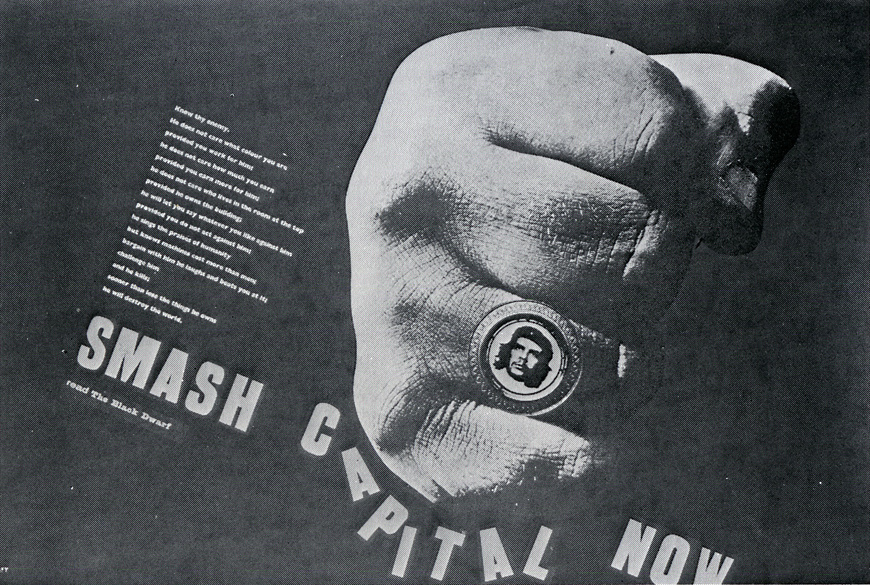
Smash capital now! poster by Christopher Logue
click to embiggen

The text (which is difficult to read from the scan) :
Know thy enemy:
he does not care what colour you are
provided you work for him;
he does not care how much you earn
provided you earn more for him;
he does not care who lives in the room at the top
provided he owns the building;
he will let you say whatever you like against him
provided you do not act against him;
he sings the praises of humanity
but knows machines cost more than men;
bargain with him, he laughs, and beats you at it;
challenge him,
and he kills.
sooner than lose the things he owns
he will destroy the world.
SMASH CAPITAL NOW
read The Black Dwarf
The referenced Black Dwarf was a British alternative newspaper published between 1968-1972,
I bet the first draft ended with "BUY the Black Dwarf" (price in 1968 : 2 shillings)

To be honest, that Che ring looks awfully aspirational.


---------------------------------

An example of propaganda to divide.

The jeremiad applies to perfectly to communist governments, like Che's Cuba, with the exception of "he will let you say whatever you like against him"

I wonder if Capital in place of Capitalists because they actually oppose the use of capital or if it was a way of dehumanizing their target?

From an economic point of view it seems that smashing capital equipment and relying on human labor would make everyone poorer. For example, people working on a sugar farm in Cuba would get more done with the use of trucks than if they had to lug everything on their backs. Since capital allows them to produce more it drives the price down making it more accessible and higher production can allow them to make more money even with a lower price. Capital also frees labor to do other things.

It seems a piece of capital like a printing press would be useful rather than workers laboriously drawing each copy with a pen.

Tuesday, January 28, 2014

How Orwellian : Antiwar songs and prowar songs

Soviet propaganda poster with Josef Stalin doing a Hitler sieg heil salute. The text reads 'ВПЕРЕД, ЗА РАЗГРОМ НЕМЕЦКИХ ЗАХВАТОВ И ИЗГНАНИЕ ИЗ ИЗ ПРЕДЕЛОВ НОШЕЙ РОДИНЫ!' aka 'Forward to defeat the German invaders and expulsion from the limits of of the motherland.'
Josef Stalin practices his Nazi salute
(eventually, Seeger realized Stalin wasn't the bees knees, but that wasn't until 2007.)


from Pete Seeger's New York Times Obituary :


When he returned to New York later in 1940, Mr. Seeger made his first albums. He, Millard Lampell and Mr. Hays founded the Almanac Singers, who performed union songs and, until Germany invaded the Soviet Union, antiwar songs, following the Communist Party line. Mr. Guthrie soon joined the group.

During World War II the Almanac Singers’s repertory turned to patriotic, antifascist songs, bringing them a broad audience, including a prime-time national radio spot. 

"Antiwar songs" and "antifascist songs"?  Why didn't the writer use the available symmetry in terminology :  Seeger played antiwar songs and prowar songs.

Those weren't really anti-war songs. They were less against war in general and more against any opposition to the revanchist wars of the USSR and their Nazi partners in crime. Opposing any effort to prevent Poland from being invaded and carved up is somehow "antiwar" while the NY Times describes his songs after the invasion of the USSR as "patriotic, antifascist songs" instead of prowar songs.

Seeger was essentially saying "Leave poor Stalin & Hitler alone! Poland, Latvia, Lithuania, Estonia, Poland, and Finland are faraway, foreign, irrelevant places" until his pet USSR was attacked that is.

To paraphrase Grouch Marx : These are my principles, if you don't like them … well, the party might tell me if I have others.

Thursday, November 14, 2013

How Orwellian : Women live longer than ever – women hardest hit

map of US life expectancy gender gap (here)


The headline is "U.S. Life Expectancy Map: The Gender Gap" with the subhead "Ladies Last" on this National Geographic piece by Amanda Fiegl

How long do you have? It depends on gender and geography. In the U.S., women live longer—81 years on average, 76 for men—but a recent study by the Institute for Health Metrics and Evaluation reveals a troubling trend. Though men's life spans have increased by 4.6 years since 1989, women have gained only 2.7 years, perhaps because a larger percentage of women have lacked adequate treatment for high blood pressure and cholesterol. "This is a wake-up call," says study co-author Ali Mokdad.

The question remains whether the "troubling trend" is that men's life expectancy has increased or if the troubling part is that women life expectancy increased less than men.

Despite the article's subhead reading "Ladies Last" the map is labeled "Margin by which women outlive men" with, apparently, no areas of the US where men outlive women. Poor, poor ladies last.

In looking for the context of the quote "This is a wake-up call"  this USA Today article shows that Ali Mokdad was referring not to men's increase or the comparative increase of women's but to some areas that have had a stagnation or decrease in life expectancy.

Amanda Fiegl's blinkered one-sidedness is similar to the WEF Gender Gap report mentioned previously.

Sunday, November 3, 2013

More phony egalitarianism

To continue a critique of the World Economic Forum's Global Gender Gap report started here.


 Kazakhstan - Health and Survival
women are doomed!

Bizarrely, 0.9796 is the highest score for any country listed in the Health and Survival category (p19). Even Kazakhstan (p240) which is listed with an inverted sex ratio at birth* (1.06 – more girls are born than boys while in every other country listed has more boys born than girls) and women have a much higher life expectancy than men (60 for women and 53 for men; a 1.13 ratio) their score still maxes out at 0.9796 – still shy of the "equality" score of 1. The WEF must really hate women to define their terms so women can never be equal.

Even keeping in mind that they truncate the subcategory scores at the "equal" levels (the Kazakh sex ratio of 1.06 is truncated to 0.94 and the Kazakh life expectancy of 1.13 is truncated to 1.06) I'm not sure how Kazakhstan could be scored at less than one.

Update : on page 36 are footnotes #6 and #7 which read :

6 This is not strictly accurate in the case of the health variable, where the highest possible value a country can achieve is 0.9796. However, for purposes of simplicity we will refer to this value as 1 throughout the chapter and in all tables, figures and Country Profiles.
7 Because of the special equality benchmark value of 0.9796 for the Health and Survival subindex, it is not strictly accurate that the equality benchmark for the overall index score is 1. This value is in fact (1 + 1 + 1 + 0.9796) / 4 = 0.9949. However, for purposes of simplicity, we will refer to the overall equality benchmark as 1 throughout this chapter.
So where does 0.9796 come from and why not make it conform to the standard of 1?  The weighting mentioned on p5-6 doesn't seem to do it or I may be doing it wrong.
0.693 * 0.94 =  0.65142
0.307 * 1.06 =  0.32542
0.65142 + 0.32542 = 0.97684

On page 35 they state "On average, in 2013, over 96% of the gap in health outcomes… has been closed. No country in the world has achieved gender equality."

The average Health and Survival score I came up with (using their truncated scores from p12-13) is 0.97115. That is 99.1% of the maximum possible score of 0.9796.   If they didn't truncate at their life expectancy equality maximum and used a definition of life expectancy "equality" that didn't depend on men living a shorter span then the global life expectancy average would be 1.0586 - in the real world that would be men suffering inequality.


(* as an aside, Kazakhstan sex ratio at birth appears to be incorrect. The CIA World Factbook also lists the sex ratio at birth to be 0.94 male(s)/female but for the sex ratio of the 0-14 years cohort as 1.01 male(s)/female; and the total population sex ratio as 0.92 male(s)/female (2013 est.). The total population ratio is consistent with the life expectancy while a massive die off of girls 0-14 years doesn't seem to be reflected in the life expectancy numbers. It appears the male/female sex ratio numbers were transposed. Update : the WEF and the CIA appear incorrect; the Kazakh sex ratio according to Kazakhstan government statistics has been 1.06 males/females for each year from 2006-2010 – pdf page 12)


World Economic Forum logo -Committed To Improving The State Of The World
WEF logo - Committed To Improving The State Of The World (unless you are a guy)

By the way, which country does the World Economic Forum rank as most equal when it comes to Life Expectancy? The number one ranking (page54) belongs to the Russian Federation where women's life expectancy is 65 and men's life expectancy is 55 (a ratio of 1.18:1). Equality!

In the interest of equality and bringing awareness to the magnitude and scope of gender-based disparities, I'll note that only in 6 countries is the female life expectancy not equal or greater than male and the worst life expectancy ratio listed for women is Trinidad and Tobago's 0.97 (or 1.03 as expressed men:women instead of women:men). Considerably less severe than the gender gap in Russia.

Only 18 out of 135 countries have a sex ratio score below their standard of "equality" 0.94. I will point out again that they considered measuring the gender gaps of both men and women but instead decided on page 5 that "We find the one-sided scale more appropriate for our purposes."


United Kingdom - Political Empowerment
Political Empowerment Rank 29, Score 0.275
Years with female head of state (last 50)
rank :8
score :  0.30
sample average :0.20
Female :12
Male :38
Female-to-male ratio :0.30

I see 2 problems with this aside from the worthwhileness of the subcategory in assuming the importance of a single person and that it is a score based largely on the distant past.

First, 12 divided by 38 is 0.31578 not 0.30. To claim precision to the ten-thousandths (as in the overall Political Empowerment category score p19) and then to round a subcategory seems odd. They appear to be using whole numbers in the subcategories but calculating with more more precise numbers (Thatcher's 11.5years /38.5 = 0.2987)

Second, Queen Elizabeth II is the head of state of the United Kingdom and has been since 1952. So the score should be 1 (as their policy is to truncate the score at the "equal" value)

Ah, I see that on page 4 they chose to redefine the head of state :
…we include the ratio of women to men in terms of years in executive office (prime minister or president) for the last 50 years.

Did Helen Clark the prime minister of New Zealand have a penis?
New Zealand - Political Empowerment
was Helen Clark a dude?
For everyone except the WEF, the head of state of New Zealand is the aforementioned Queen. Using the WEF's definition of head of state we find that the WEF thinks Helen Clark and Jenny Shipley were male as they list the number of years with a female head of state as zero (p296).  They must not consider the Governor-General to be the head of state as more than 10 years of Governors-General have been female. Perhaps New Zealand has a secret phallocratic government.

Wednesday, October 30, 2013

How Orwellian : Gaps in understanding the meaning of equality

The WEF's Gender Gap report (PDF) redefines inequality as equality. 


US Educational Attainment (page 370)

The female to male ratio of USA enrollment in tertiary education is 1.41 but it is scored as "1" (1 = Equality). There is no extra credit given for women being in an advantageous position as the maximum score is one. When there is a gender gap where men suffer then it is defined as equality.


Fiji Educational Attainment (page 198)
The result of truncating the score at 1 is that Fiji's Educational Attainment has women equal to men or leading men in 3 of the 4 subcategories but because they trail in one subcategory the entire category is graded as showing inequality to women.


Cameroon Health and Survival (page 158)
Further, they define the "equal" life expectancy ratio at 1.06:1. If men and women have the same life expectancy, like Cameroon, then that is marked as inequality. 

Also note that the Sex ratio at birth is bounded at a predetermined "equal" value of 0.94 instead of Cameroon's actual 0.97. The result is that despite being equal in life expectancy and higher in sex ratio at birth the result is a overall Health and Survival score of 0.961 – Not Equal. 


As an aside, I'm unclear as to why "Sex ratio at birth" is a significant category. It doesn't capture female infanticide (except for sex selective abortion) and unlike most categories it doesn't seem determined by traditions or social institutions. A cynical person might suggest that it is a subcategory added solely to lower the Health and Survival average and to game the OMGsomethingHasToBeDone system.


Burundi Health and Survival (page 154)
Burundi's women have a higher sex ratio at birth than average and a higher life expectancy than men. This may lead some to think men are suffering inequality. Not according to the WEF. Because the sex ratio at birth score is capped at 0.94 and because women outlive men but do not outlive them to a sufficient degree that means the women of Burundi are the ones suffering inequality. 

In Australia (p120) men have a lower life expectancy than women by 3 years which the WEF scores as women suffering a gender gap. 

It is interesting to note the existence of a category listed under "Additional Data - Social Instutitions" : "Quota type" which notes if there are laws requiring a quota of female candidates or if laws require seats in the legislature be reserved for women.


On page 4 they acknowledge that they could present both gaps in the achievements of women and also the gaps in men's achievements but "We find the one-sided scale more appropriate for our purposes." 


One might get the impression these are not the most rigorous egalitarians.


the critique of the WEF Gender Gap report continues here.

Sunday, May 19, 2013

Propaganda posters from the Spanish Civil War

Propaganda poster from PSUC during the Spanish Civil War. Mes Homes! Mes Armes! Mes Municions! (translated into english is More men! More arms! More ammunition!) Signed Olé?
click to embiggen

Mes Homes!
Mes Armes!
Mes Municions!
(translated from Catalan : More men! More arms! More ammunition!)

The UGT on the armband refers to the Unión General de Trabajadores (General Union of Workers) which was usually associated with Partit Socialista Obrer Espanyol (PSOE - Spanish Socialist Workers Party) and the PSU in the corner is Partit Socialista Unificat aka the political party PSUC (Partit Socialista Unificat de Catalunya) which was part of the Comintern and Stalinist (in the sense that they supported and were supported by Stalin but also in the sense that they killed people who disagreed with them). This mainly Catalan political party didn't put the Spanish flag or the Catalan flag on their poster but the hammer and sickle (it is the same as the USSR flag except for lacking the star) :

Propaganda poster from PSUC : Ingresseu al partit socialista unificat - The Clenched Fist Salute : the Nazis weren't the only ones convincing people to publicly make silly hand gestures in unison.
PSO PCC USC PCP Ingresseu al Partit Socilista Unificat (Enters the Unified Socialist Party)
PSUC (Partit Socialista Unificat de Catalunya) was formed in 1936 by the merger of :
  1. the PSO was the Partit Socialista Obrer (Party of Socialist Workers)
  2. the PCC was the Partit Comunista de Catalunya (Communist Party of Catalonia)
  3. the USC was the Unió Socialista de Catalunya (Socialist Union of Catalonia) and
  4. the PCP was the Partit Català Proletari (Proletarian Catalan Party).
The bottom left reads "editat del sindicat de dibuixants professionals UGT" (published UGT union of professional illustrators). The bottom right is something indistinct and "…Barcelona." Signed "Rafel Tona del S.D.P." (SDP = Sindicat de Dibuixants Professionals).

The Clenched Fist Salute : the Nazis weren't the only ones convincing people to make silly hand gestures in public.


Boles, La Cinquena Columna Spanish Civil War poster by Lorenzo Goñi
boles, la cinquena columna (Bowls, the fifth column)

I don't understand this one. "Boles" is Catalan for "balls." (and it is Spanish for "bowls", the noun not the verb, which would make even less sense.) Are balls reactionary?  Bocce ball is considered fascist? Is it that the 5th column is snowballing? The first guy with a crown represents royalists, the second person has a rosary to represent Catholics and the rest I'm not sure. Are the towers supposed to be radio towers, telephone lines, a goal, or what?

Note the red seal at the lower left that says "department d'agit propaganda del…" (Department of Agitation Propaganda of [PSUC]…). At some point, propagandists continually debased facts so badly and so often that the term "propaganda" became derogatory and so people stopped labeling propaganda as propaganda.

Of the Nationalists factions, the Carlists used a Cross of Burgundy flag and Franco adopted the Falangists' symbol of a group of arrows with a yoke. The Nazi swastika doesn't seem to have been used extensively by the Nationalists. From what I've seen even the planes of the German Condor Legion were not marked with the swastika. I have seen a photo of Franco's car and it did have a swastika on it on at least one occasion and more importantly Franco and the Nationalists received support from both Nazi Germany and Fascist Italy including German airplanes and thousands of Italian soldiers. The swastika was not the symbol the Nationalists most associated with themselves but their opponents certainly associated them with it.

Venus Dictator in Furs. Painting by Paco Ibera

Franco in furs like Bette Davis.  He wears his Miss España sash in the traditional Spanish colors (as opposed to the red, yellow & purple of the Republican flag) and on his chest is a maltese cross (an order of knighthood perhaps? – this forum leads me to the Grand Cross of the Order of San Fernando). Below the cross is a pin of the symbol of the Falangists. His hand rests on a cane while his other hand holds his hat; a garrison cap with a gold tassel. He tries to strike a regal pose. Franco alone takes up nearly half of the image.

On the lower left is a cartouche with Franco's well known and brief declaration of the end of the Spanish Civil War. In a Roman font it declares in large type "La Guerra ha terminado" (The war is over).  There is probably no connection between this and John Lennon's song "War is Over."

The cartouche also says "Parte oficial de guerra. Correspondiente al dia 1º de Abril de 1939 - III Año Triunfal." (Official report of the war. Corresponding to 1st day of April 1939 - Triumphal Year III.) "Triumphal Year III" is itself propaganda, imitating Mussolini's declaration of 1922 (the year Mussolini came to power) as Year One. Declaring a Triumphal Year and Triumphal Year II without being completely triumphant doesn't seem ideal.

"En el día de hoy cautivo y desarmado el ejército rojo, han alcanzado las tropas nacionales sus últimos objectivos militares. Burgos, 1 de abril de 1939 Ano de la Victoria" (On this day, with a captive and disarmed Red Army, the national troops have reached their final military objectives. Burgos – a city in Northern Spain, 1 April 1939 Year of the Victory.)

At the top of the cartouche is a new Spanish coat of arms that harkens back to the royal coat of arms used from 1469 to 1516. Behind the black bird (eagle of Saint John) is a ribbon reading "Una, Grande, Libre" (one, great, free). Declaring Spain to be united was a fiction and free is not what one most associates with a dictator.

At the bottom left of the cartouche is the seal of Franco reading "cuartel general del Generalisimo, estado mayor" (General barracks of the Generalisimo, major staff).

The flags in the background include :

several red and yellow Spanish National flags (they appear to be civil flags without the royal seal)

several Falangist flags (red-black-red with the Falangists symbol in red on the black stripe)

several appear to be the Carlists' Cross of Burgundy (a jagged red cross on a white field)

one Spanish Morocco's Royal standard (green flag with a yellow pentagram)

I think, one Flag of the Khaliph of the Spanish Protectorate of Morocco (green flag with a yellow star of David) although it may be the same as above.

There are no swastikas, nor any acknowledgement of the German or Italian forces that fought in the war.

The men in the background march : some on horses, some wounded, some dressed like beduins, some in berets, some in helmets, some giving a roman salute (ie a fascist salute), some carrying flags, and some oddly shaped aircraft in the upper right (Savoia-Marchetti SM.81 without the fixed landing gear or JU-52s?).


Dos and Don'ts of do it yourself propaganda : 
  1. Do use Repetition! Repetition! Repetition! Repetition!
  2. Do keep in mind it is more than just words : the black smear behind the guy in the white shirt towards the upper left corner probably exists only to make it a better composition.
  3. Do sign it! (although, one might recommend signing it in a legible way. The top one is signed by Solá, the second by Rafel, the third one is signed by Lorenzo Goñi; the fourth is signed, I think, in the lower right corner by Paco Ibera.) 
  4. Do stake out the idea that there are only two sides (the real world is more complex. Keep in mind that this black and white attitude and the tendency to simply lie about the other side is among the reasons why many people don't like or respect propaganda. So, don't do this if you want to be respected.).  The Franco declaration suggests that there were only 2 sides and that because the officials of the Republic surrendered then people would think there was no one in opposition.  Most people will accept the rigid dichotomy instead of thinking how many people fall out side the binary choice – like Joan Pujol who was imprisoned by and disliked both the Nationalist government and the Republican government.
  5. Don't call it propaganda as some people will simply shrug and think "Ah, another person who feels the need to lie or mislead or be blindly partisan to support their cause."
  6. When showing your side, do keep them blocky, stylized, simplified and in unison. When showing the other side then details become acceptable to make them grotesque and unappealing. Although, I would point out that the Nationalists are depicted as being happy; in stark contrast to most figures in propaganda. The other posters are using the blocky, stylized, simplified figures in unison as a symbol of power. They could portray their side as happy little smurfs or even happy little barbarians but people know when they are happy and propaganda that tells them they are happy when they aren't would not be effective.