Showing posts with label graphs. Show all posts

Monday, January 23, 2017

Bad graph : Requiem for the American Dream (2015)

A Bad Graph from the movie Requiem for the American Dream (2016) at about 42 minutes in

the graph is labeled at left  "% of total tax revenue"


Noam Chomsky : During the period of great growth of the economy the 50s and the 60s, but in fact earlier, taxes on the wealthy were far higher. Corporate taxes were much higher, taxes on dividends were much higher, simply taxes on wealth were much higher. The tax system has been redesigned , so that the taxes that are paid by the very wealthy are reduced and correspondingly, the tax burden on the rest of the population is increased.

My first thought was that "% of total tax revenue" meant the percentage of all Federal tax revenue – which seemed like an odd measure. My second thought was that graph sure doesn't show much in way of business cycles. That would be because they labeled it "% of total tax revenue" instead of the less ambiguous "tax rate." It turns out that the tax rate on "dividends were much higher" but the "taxes that are paid by the very wealthy are" increased and, contrary to Chomsky, not "reduced."

graph showing capital gains tax rate and the inflation adjusted revenue


------------------
towards the end

The tendencies we've been describing within American society; unless they are reversed, it's going to be an extremely ugly society. It's a society based on Adam Smith's vile maxim: all for myself, nothing for anyone else. A society in which normal human instincts and emotions of sympathy and solidarity and mutual support are driven out. That's a society so ugly I don't know who would want to live in it. I wouldn't want my children to. 
If only Adam Smith had some sort of Theory of Moral Sentiments. Of course, "all for myself, nothing for anyone else," was described by Adam Smith as a "vile maxim" and was not his vile maxim.


Wednesday, November 16, 2016

Bad graph : Washington Post abortion graph #2


from the Washington Post is this 2013 article by Sarah Kliff titled "CHARTS: How Roe v. Wade changed abortion rights". The map from this article was previously mentioned here.


5. Abortion has become increasingly concentrated among low-income, minority women. Over the past four decades, the demographics of abortion have shifted significantly. In 1973, white women accounted for over three-quarters of all abortions. Now, that number hovers just below 60 percent.

In 1973, white women had over 75% of abortions at a time when white women were an even larger segment of the population (87.7% of the population at the 1970 census). Although she says "Now, [article written in 2013] that number hovers just below 60 percent" for some unexplained reason her graph only goes up to 2004. The word "now" has to do a lot of work to cover nearly a decade. In the 2000 census whites were 75.1% and in the 2010 census whites were 72.4%. So the big news is that as national demographics changed so did the demographics of abortion. Quelle Surprise.

An even better comparison would be to breakdown the demographics by women of childbearing age or by pregnancies.

Her assertion about low income women getting a greater share of abortions is backed by a graph. That makes it odd that she would lead with and write more text about this weaker conclusion.

Saturday, June 11, 2016

bad graph : Washington Post's abortion map

The lesson of this bad graph is don't just look at the graph but read the text.

from the Washington Post is this 2013 article by Sarah Kliff.


1. Before the Roe decision, most states did not allow legal abortion.


while the map does paint a certain picture by referring to "repeal" and "reform" of abortion laws. and the subhead says "most states did not allow legal abortion" the text walks that back considerably :
...Through the mid-1960s, 44 states outlawed abortion in nearly all situations that did not threaten the life or health of the mother. States began liberalizing their abortion laws in the 1960s and 1970s. This map shows the situation in the early-1970s, when Roe was decided.

The four maroon states legalized abortion in nearly all cases before the fetus was viable. The 14 pink states allowed abortions in some circumstances. Nearly all others continued to ban abortion in most cases.
This source lists the reformed group as : Colorado, North Carolina, California, Georgia, Maryland, Arkansas, New Mexico, Kansas, Oregon, Delaware, South Carolina, Virginia and Florida. I only count 13 which is also the count on the map.

The part I bolded hollows out the headline. So, the subhead should read "1. Before the Roe decision, most states DID allow legal abortion."  And the map should look different.

Note that unlike Kliff I include both a map showing an accurate representation of the subhead and also a map detailing what abortion laws actually looked like.

note that I haven't looked into  the specific restrictions of Pennsylvania, Massachusetts and New Jersey's laws outlawing "unlawful" or "unjustified" abortions and what a lawful or justified abortion would be. The source used for the map (Journal of Obstetric, Gynecologic, & Neonatal Nursing April 1972) does note that in contrast to Pennsylvania and Massachusetts, New Jersey had a higher abortion rate than almost any other state.
Note #2 : I'm not sure what the previous laws in Wisconsin and Texas were. Texas, where Roe v Wade originated, did include an allowance for rape.
Note #3 (added Oct 2016) : Washington DC, which I didn't place on the map would be black like Texas and Wisconsin (abortion laws had been invalidated by the courts pre-Roe vs Wade)

Sunday, June 5, 2016

movie notes / Bad statistics : Philomena (2013)

Philomena (2013) starring Steve Coogan and Judi Dench.


The son's sister : "He wasn't too happy the last years of his life, working for Reagan. He was pretty messed up about it."
Steve Coogan's character : "The Republicans withdrew funding for AIDS research because they blamed the epidemic on the gay lifestyle."
And yet the budget went up every single year throughout Reagan's term (table below from linked pdf).


Update (Nov 12, 2017; nearly a year and a half later LOL) : It dawned on me that Congress appropriates funding. Hmmm, who was in charge of Congress?
When Reagan took office House 244 (D) to 191 (R), Senate 46 (D) to 53 (R) and one independent
1983-85  House 272 (D) to 163 (R), Senate 45 (D) to 55 (R)
1985-87 House 253 (D) to 182 (R), Senate 47 (D) to 53 (R)
1987-89 House 258 (D) to 177 (R), Senate 47 (D) to 53 (R)
The final weeks of the Reagan administration : House 251 (D) to 183 (R), Senate 55 (D) to 45 (R)

So throughout Reagan's term, the Republicans never were even close to a majority in the House and except for the very end where they became a minority they had a slight majority in the Senate but at no point had a filibuster proof majority.

Sunday, January 6, 2013

incompetent graphmaking from USA Today

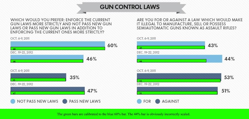
USA Today' Incompetent Graph About Gun Control Poll question 'are you for or against a law which would make it illegal to manufacture, sell or possess semiautomatic guns known as assault rifles?'
click to embiggen
The green bars are calibrated to the blue 60% bar. The 44% bar is obviously incorrectly scaled.

This USA Today's poll results graph is a bit skewed. There are 2 questions shown :
1) "Which would you prefer: enforce the current gun laws more strictly and not pass new gun laws or pass new gun laws in addition to enforcing the current ones more strictly?"
2) "Are you for or against a law which would make it illegal to manufacture, sell or possess semiautomatic guns known as assault rifles?"

All of the bars are on the same scale except for one. The 44% bar showing a one point increase in support is exaggerated.   And it just coincidentally happens to enlarge the bar showing support for a ban to the same size as those who oppose it. The green bars show the roughly correct scaling.


------------------


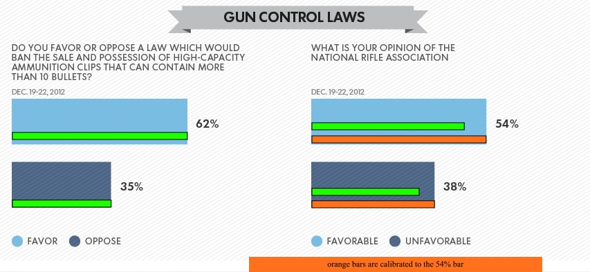
Their third graph used a different scale for each question. They should know that using 2 different scales make it the results less clear than they should be. They don't even mention that they are on a different scale.

USA Today using 2 different scales to on 2 bar charts side by side making the results less clear than they should be.
click to embiggen
the green bars are calibrated to the blue 62% bar on the left and the orange bars are calibrated to the blue 54% bar on the right