Thursday, January 17, 2013

Not a painting

Kate Middleton's official portrait painting

It isn't a painting but a photograph that has been printed using a labor intensive process involving paint.

It has that look of someone imitating a photo where they carefully transcribe each small detail they see in the photo but then the hair is given a different, less detail conscious treatment. It happens a lot.

The expression is also a photographic moment frozen in time. People don't see one another that way; we see the start point and end point of an expression and a blur and an approximation of what we think the transition expression is. Consequently, I think it looks less natural and I think most people can tell instinctively when it is based on a photograph.

As a photo, it isn't that bad (although it probably be better in black & white) but as a painting it lacks. It lacks charm and panache (In contrast, Feliks Topolski painted the British monarchy
 with what some might call an overdose of panache). Maybe there is a painterly quality when someone stands in front of it but I have my doubts.

This guy refers to it as "[a] jowly face that will now be staring at us… Is that scratchy rug atop her head really meant to be Kate's famously silken locks? And what's going on with the mean, wierdly [sic] spaced eyes? And don't get me started on the nose." (Is a writer who refers to himself as "the Royalist" required to write like a Drama Queen?)
the source photo used for Kate Middleton's official portrait painting by Paul Emsley
The photographic basis of the painting.  If the photocopier hadn't been invented he could have gotten a job at Xerox.

Kate Middleton's official portrait painting showing her enormously oversized head with the artist Paul Emsley and the press
Kate Middleton's official portrait with the artist Paul Emsley (I suspect her head isn't really that large in person)
The above 2 pics are from here.  Personally, I think making the painting larger than life size can make it a worse painting. A little larger than life (say, 10%) makes it seem heroically large (exaggerated but still within the realm of being realistic). Extraordinarily larger than life (10x, like Chuck Close) makes it a landscape of humanity.  In between is this picture : a lot larger than life (2x) which makes it seem oversized and perhaps grotesque. It reminds me of advertising art on the side of a building that was intended to be seen from a distance.

Sunday, January 6, 2013

incompetent graphmaking from USA Today

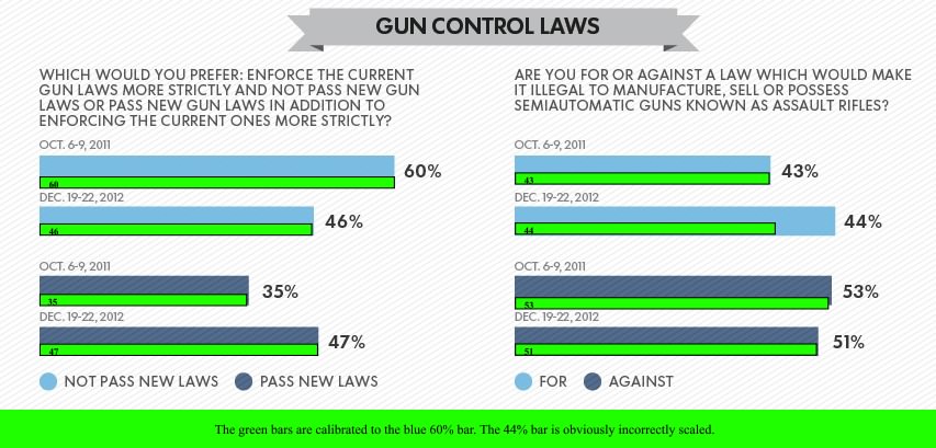
USA Today' Incompetent Graph About Gun Control Poll question 'are you for or against a law which would make it illegal to manufacture, sell or possess semiautomatic guns known as assault rifles?'
click to embiggen
The green bars are calibrated to the blue 60% bar. The 44% bar is obviously incorrectly scaled.

This USA Today's poll results graph is a bit skewed. There are 2 questions shown :
1) "Which would you prefer: enforce the current gun laws more strictly and not pass new gun laws or pass new gun laws in addition to enforcing the current ones more strictly?"
2) "Are you for or against a law which would make it illegal to manufacture, sell or possess semiautomatic guns known as assault rifles?"

All of the bars are on the same scale except for one. The 44% bar showing a one point increase in support is exaggerated.   And it just coincidentally happens to enlarge the bar showing support for a ban to the same size as those who oppose it. The green bars show the roughly correct scaling.


------------------


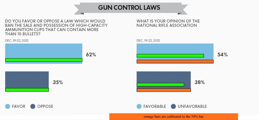
Their third graph used a different scale for each question. They should know that using 2 different scales make it the results less clear than they should be. They don't even mention that they are on a different scale.

USA Today using 2 different scales to on 2 bar charts side by side making the results less clear than they should be.
click to embiggen
the green bars are calibrated to the blue 62% bar on the left and the orange bars are calibrated to the blue 54% bar on the right

In My Garden of Love

Benny Hill - My Garden of Love

The lyrics :

In my garden of love

Now there’s a rose for the way my spirits rose when we met
A forget-me-not to remind me to remember not to forget
A pine tree for the way I pined over you
And an ash for the day I ashed you to be true

And the sun and the rain fell from up above
And landed on the earth below
In my garden of love

Now there’s a beetroot for the day you said that you’d beetroot to me
A sweet pea for the sweet way you always used to smiled at me
But you had friends who needed you
There was Ferdy, there was Liza
So, just for them, I put down a load of ferdy-liza

And the sun and the rain fell from up above
And landed on the earth below
In my garden of love

Oh, Gus the gardener’s left now and you went with him, too
The fungus here reminds me of the fun Gus is having with you
The rockery’s a mockery, with weeds it’s overgrown
The fuchsia’s gone, I couldn’t face the fuchsia all alone

And my tears fell like raindrops from the sky above
And poisoned all the flowers in my garden of love

Tuesday, January 1, 2013

Happy Nude Year!

Standing Bather by Edgar Degas, c1883-4, 12 1/8 x 9 3/8 in charcoal, pastel, watercolor
click to embiggen


Standing Bather by Edgar Degas, c1883-4,  charcoal, pastel and watercolor, 12.125" x 9.375"

Monday, December 24, 2012

A French accent isn't that hard

A French accent isn't that hard and there is such a thing as French actors (and there is even such a thing as unpretentious French actors) so I don't understand why some movies have people speaking with a British accent when the character is French.  If it were an all-British production it would be more understandable but even the American actors put on a British accent. Almost everything is in English except they will say "monsieur" and "mademoiselle" instead of Sir and Madam and French proper names, some or all written text, and the names of locations are said in French.

They could simply make the point that the setting is France with a graphic in the beginning that says "Location : Paris, France" and then carry on in English. Or they could do it in French and subtitle it.

I assume the reasoning is due to one of or several of the following :
a) A shortcut to let it sound foreign and yet understandable.
b) Hollywood has a very, very poor grasp of geography.
c) A ploy to piss off the frenchies.

A couple examples from the movie Hugo (2011)  (keep in mind that every single character is supposed to be French) :


As I recall, another example would be the 1998 movie version of Les Misérables which had a mess of accents, mostly not French – specifically, Liam Neeson didn't bother putting on an accent and Claire Danes' French character alternated between an American and a British accent.

-----------------------------

It's an interesting poster/mural from the movie Hugo.  A globe, a chubby body with something exiting his heart, a blob and a VU on either side. It looks vaguely familiar but I can't place it. I'd love to know what it is.