Thursday, November 14, 2013

How Orwellian : Women live longer than ever – women hardest hit

map of US life expectancy gender gap (here)


The headline is "U.S. Life Expectancy Map: The Gender Gap" with the subhead "Ladies Last" on this National Geographic piece by Amanda Fiegl

How long do you have? It depends on gender and geography. In the U.S., women live longer—81 years on average, 76 for men—but a recent study by the Institute for Health Metrics and Evaluation reveals a troubling trend. Though men's life spans have increased by 4.6 years since 1989, women have gained only 2.7 years, perhaps because a larger percentage of women have lacked adequate treatment for high blood pressure and cholesterol. "This is a wake-up call," says study co-author Ali Mokdad.

The question remains whether the "troubling trend" is that men's life expectancy has increased or if the troubling part is that women life expectancy increased less than men.

Despite the article's subhead reading "Ladies Last" the map is labeled "Margin by which women outlive men" with, apparently, no areas of the US where men outlive women. Poor, poor ladies last.

In looking for the context of the quote "This is a wake-up call"  this USA Today article shows that Ali Mokdad was referring not to men's increase or the comparative increase of women's but to some areas that have had a stagnation or decrease in life expectancy.

Amanda Fiegl's blinkered one-sidedness is similar to the WEF Gender Gap report mentioned previously.

Monday, November 11, 2013

Charles P. Pierce is an idiot


(a reprise from elsewhere from the day of the Boston Marathon Bombing (Apr 15, 2013)  but as far as I'm aware Charles P. Pierce is still an idiot.)

from Charles P. Pierce at Esquire : 
"Obviously, nobody knows anything yet, but I would caution folks jumping to conclusions about foreign terrorism to remember that this is the official Patriots Day holiday in Massachusetts, celebrating the Battles at Lexington and Concord, and that the actual date (April 19) was of some significance to, among other people, Tim McVeigh, because he fancied himself a waterer of the tree of liberty and the like."

Don't jump to conclusions about foreigners when you can jump to conclusions about your fellow citizens.
-----------------
that this is the official Patriots Day holiday in Massachusetts, celebrating the Battles at Lexington and Concord, and that the actual date (April 19) was of some significance to, among other people, Tim McVeigh.

Follow the logic : 
  • there is a bombing on April 15
  • April 15 is Patriot's Day in Massachusetts (third Monday in April since 1969)
  • Patriot's Day in Mass used to be on April 19
  • In 1995, Patriot's Day fell on April 17 and Tim McVeigh (b. 1968) said his act of mass murder was done on April 19, 1995 as that was the anniversary of the end of the Waco Seige.
  • Therefore there might be a connection between McVeigh's bombing on April 19 and the April 15 Boston Marathon bombing.
  • Connect the dots, Sheeple!


Although it may have missed the grasp of Charles P. Pierce, my guess would be that the date of the Boston Marathon bombing was chosen based on the date that the Boston Marathon was scheduled to be held. Imagine the Groundhog Day Liberation Front trying to bomb the Boston Marathon on Feb 2. 

Wednesday, November 6, 2013

Art as a Creative Endeavor : Ingres vs Romans

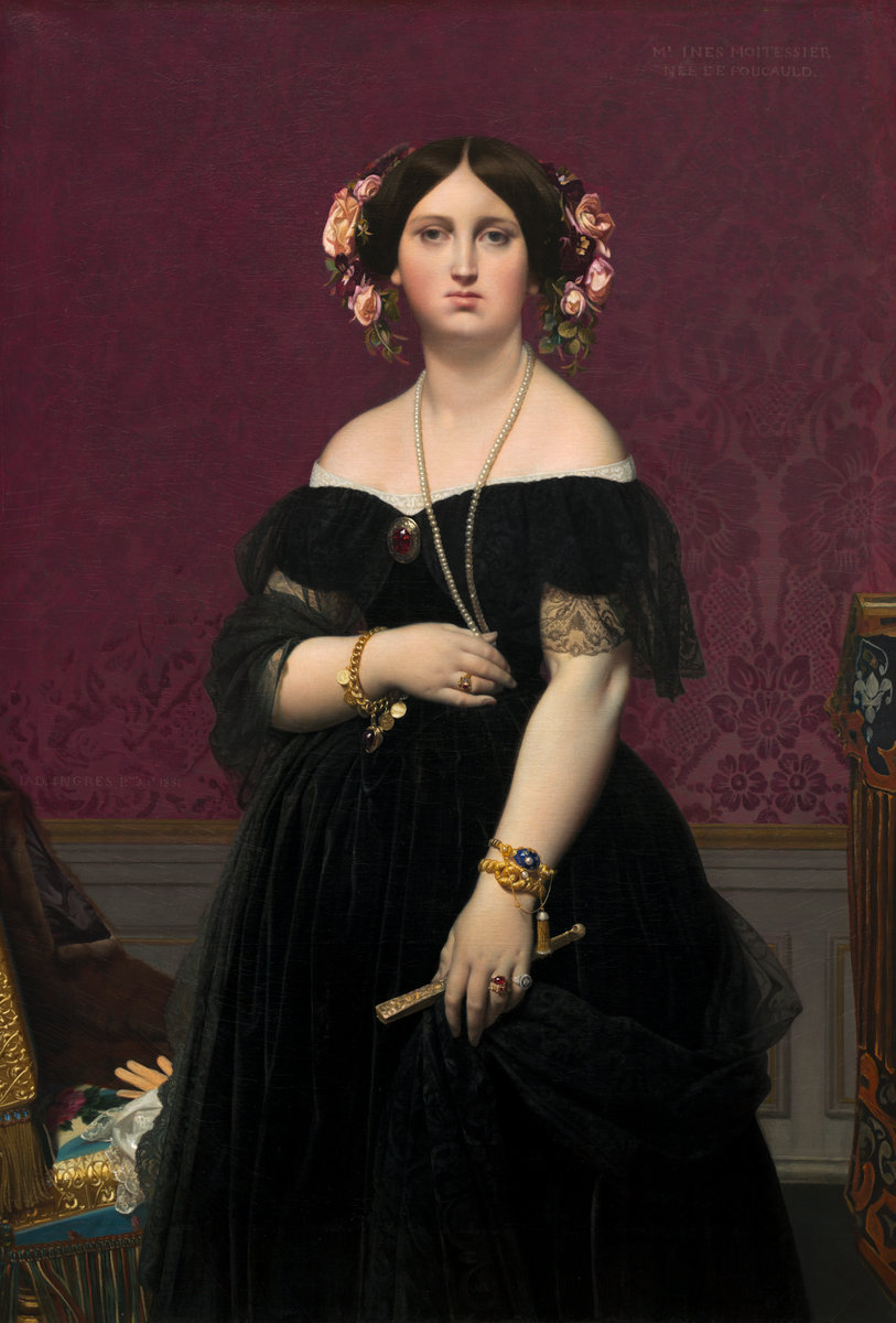
JAD Ingres painted 2 portraits of Madame Moitessier (born Marie-Clotilde-Inès de Foucauld). The first one he started working on is the seated portrait below. It was commissioned in 1844, drawn onto the canvas by 1847 but not completed until January of 1857.

The second (or the first one completed) was started and finished in 1851 and is the portrait of her standing which is now at the US National Gallery of Art and mentioned previously.


.portrait of Madame Moitessier by JAD Ingres
click to embiggen
Portrait of Madame Moitessier Seated by Jean-Auguste-Dominique Ingres, 1851
oil on canvas, 120 cm × 92 cm (47 in × 36 in), British National Gallery, London, UK


Roman Fresco of Hercules and Telephus from the ruins of Herculaneum, 1st century AD

Roman fresco of Hercules and Telephus from Herculaneum which influenced the portrait of Madame Moitessier by JAD Ingres
Roman Fresco of Hercules and Telephus in color (Telephus is Hercules' son and is being suckled by the doe in bottom left) "Herakles Finding His Son Telephus"
79.5 x 63.375 in, Musei Nazionale, Naples, Italy
Ingres' original concept was to include Moitessier's daughter in the painting. However, the child did not sit well and progress on the painting took years. One wonders, would she have been the child behind the sitting woman (the pan flute makes me think it might be a satyr) or the child suckling a deer?

study for the seated portrait of Madame Moitessier by JAD Ingres
Study for the Portrait of Madame Moitessier Seated by Jean-Auguste-Dominique Ingres superimposed on the painting, c1846-48, graphite on paper 6.375 x 4.625 inches (16.2 x 11.8 cm)
The pencil drawing above superimposed onto the painting shows the oval head of Mme Moitessier's daughter, Clotilde-Marie-Catherine who was born March 19, 1843. That means at the time of the commission Clotilde was one year old, at the time of the pencil drawing she was 3 to 5 years old, and at the time of completion little Clotilde was nearly 14. The pose of the small child would be less suitable for a teenager.

Also worth noting is the second portrait in profile in the sitting portrait. It is ostensibly reflected in the mirror but to get that reflection the mirror would have to at a different angle instead of flush on the wall.

detail of the right hand in the portrait of Madame Moitessier by JAD Ingres
detail of the swollen octopus like hand
an attempt to show the scale of the 2 portraits of Madame Paul-Sigisbert Moitessier, née Marie-Clotilde-Inès de Foucauld, sitting and standing painted by JAD Ingres
an attempt to show the scale of the paintings

Sunday, November 3, 2013

French lesson

Standing Portrait of Madame Paul-Sigisbert Moitessier, née Marie Clotilde Inès de Foucauld by Jean Auguste Dominique Ingres, 1851 – 'terrible et belle tête' doesn't mean terrible and beautiful tits.
click to embiggen
Standing Portrait of Madame Moitessier by Jean-Auguste-Dominique Ingres, 1851
Oil on canvas 57.75 x 39.5 inches (146.7 x 100.3 cm)


I've come across a lot of foreign words over the years. I've roughly translated articles from foreign languages so I could read them and after a while one notices some words are shared between languages, some have a shared origin and so are similar, some words are easy to remember and sometimes you can guess the word based on the context.

For example, in French "terrible" means "terrible" and "et" means "and" in both French and Latin and the French word "Belle" besides being easy to remember is also similar to the Spanish and Italian words for beautiful.

Anyways, the painter Ingres decided to paint Mme Moitessier after meeting her and being struck by her appearance. He described as "terrible et belle tête."

It is usually best to double check a translation; "terrible et belle tête" despite fitting in with the context does not mean what I initially assumed. It turns out tête is French for head.

More phony egalitarianism

To continue a critique of the World Economic Forum's Global Gender Gap report started here.


 Kazakhstan - Health and Survival
women are doomed!

Bizarrely, 0.9796 is the highest score for any country listed in the Health and Survival category (p19). Even Kazakhstan (p240) which is listed with an inverted sex ratio at birth* (1.06 – more girls are born than boys while in every other country listed has more boys born than girls) and women have a much higher life expectancy than men (60 for women and 53 for men; a 1.13 ratio) their score still maxes out at 0.9796 – still shy of the "equality" score of 1. The WEF must really hate women to define their terms so women can never be equal.

Even keeping in mind that they truncate the subcategory scores at the "equal" levels (the Kazakh sex ratio of 1.06 is truncated to 0.94 and the Kazakh life expectancy of 1.13 is truncated to 1.06) I'm not sure how Kazakhstan could be scored at less than one.

Update : on page 36 are footnotes #6 and #7 which read :

6 This is not strictly accurate in the case of the health variable, where the highest possible value a country can achieve is 0.9796. However, for purposes of simplicity we will refer to this value as 1 throughout the chapter and in all tables, figures and Country Profiles.
7 Because of the special equality benchmark value of 0.9796 for the Health and Survival subindex, it is not strictly accurate that the equality benchmark for the overall index score is 1. This value is in fact (1 + 1 + 1 + 0.9796) / 4 = 0.9949. However, for purposes of simplicity, we will refer to the overall equality benchmark as 1 throughout this chapter.
So where does 0.9796 come from and why not make it conform to the standard of 1?  The weighting mentioned on p5-6 doesn't seem to do it or I may be doing it wrong.
0.693 * 0.94 =  0.65142
0.307 * 1.06 =  0.32542
0.65142 + 0.32542 = 0.97684

On page 35 they state "On average, in 2013, over 96% of the gap in health outcomes… has been closed. No country in the world has achieved gender equality."

The average Health and Survival score I came up with (using their truncated scores from p12-13) is 0.97115. That is 99.1% of the maximum possible score of 0.9796.   If they didn't truncate at their life expectancy equality maximum and used a definition of life expectancy "equality" that didn't depend on men living a shorter span then the global life expectancy average would be 1.0586 - in the real world that would be men suffering inequality.


(* as an aside, Kazakhstan sex ratio at birth appears to be incorrect. The CIA World Factbook also lists the sex ratio at birth to be 0.94 male(s)/female but for the sex ratio of the 0-14 years cohort as 1.01 male(s)/female; and the total population sex ratio as 0.92 male(s)/female (2013 est.). The total population ratio is consistent with the life expectancy while a massive die off of girls 0-14 years doesn't seem to be reflected in the life expectancy numbers. It appears the male/female sex ratio numbers were transposed. Update : the WEF and the CIA appear incorrect; the Kazakh sex ratio according to Kazakhstan government statistics has been 1.06 males/females for each year from 2006-2010 – pdf page 12)


World Economic Forum logo -Committed To Improving The State Of The World
WEF logo - Committed To Improving The State Of The World (unless you are a guy)

By the way, which country does the World Economic Forum rank as most equal when it comes to Life Expectancy? The number one ranking (page54) belongs to the Russian Federation where women's life expectancy is 65 and men's life expectancy is 55 (a ratio of 1.18:1). Equality!

In the interest of equality and bringing awareness to the magnitude and scope of gender-based disparities, I'll note that only in 6 countries is the female life expectancy not equal or greater than male and the worst life expectancy ratio listed for women is Trinidad and Tobago's 0.97 (or 1.03 as expressed men:women instead of women:men). Considerably less severe than the gender gap in Russia.

Only 18 out of 135 countries have a sex ratio score below their standard of "equality" 0.94. I will point out again that they considered measuring the gender gaps of both men and women but instead decided on page 5 that "We find the one-sided scale more appropriate for our purposes."


United Kingdom - Political Empowerment
Political Empowerment Rank 29, Score 0.275
Years with female head of state (last 50)
rank :8
score :  0.30
sample average :0.20
Female :12
Male :38
Female-to-male ratio :0.30

I see 2 problems with this aside from the worthwhileness of the subcategory in assuming the importance of a single person and that it is a score based largely on the distant past.

First, 12 divided by 38 is 0.31578 not 0.30. To claim precision to the ten-thousandths (as in the overall Political Empowerment category score p19) and then to round a subcategory seems odd. They appear to be using whole numbers in the subcategories but calculating with more more precise numbers (Thatcher's 11.5years /38.5 = 0.2987)

Second, Queen Elizabeth II is the head of state of the United Kingdom and has been since 1952. So the score should be 1 (as their policy is to truncate the score at the "equal" value)

Ah, I see that on page 4 they chose to redefine the head of state :
…we include the ratio of women to men in terms of years in executive office (prime minister or president) for the last 50 years.

Did Helen Clark the prime minister of New Zealand have a penis?
New Zealand - Political Empowerment
was Helen Clark a dude?
For everyone except the WEF, the head of state of New Zealand is the aforementioned Queen. Using the WEF's definition of head of state we find that the WEF thinks Helen Clark and Jenny Shipley were male as they list the number of years with a female head of state as zero (p296).  They must not consider the Governor-General to be the head of state as more than 10 years of Governors-General have been female. Perhaps New Zealand has a secret phallocratic government.

Wednesday, October 30, 2013

How Orwellian : Gaps in understanding the meaning of equality

The WEF's Gender Gap report (PDF) redefines inequality as equality. 


US Educational Attainment (page 370)

The female to male ratio of USA enrollment in tertiary education is 1.41 but it is scored as "1" (1 = Equality). There is no extra credit given for women being in an advantageous position as the maximum score is one. When there is a gender gap where men suffer then it is defined as equality.


Fiji Educational Attainment (page 198)
The result of truncating the score at 1 is that Fiji's Educational Attainment has women equal to men or leading men in 3 of the 4 subcategories but because they trail in one subcategory the entire category is graded as showing inequality to women.


Cameroon Health and Survival (page 158)
Further, they define the "equal" life expectancy ratio at 1.06:1. If men and women have the same life expectancy, like Cameroon, then that is marked as inequality. 

Also note that the Sex ratio at birth is bounded at a predetermined "equal" value of 0.94 instead of Cameroon's actual 0.97. The result is that despite being equal in life expectancy and higher in sex ratio at birth the result is a overall Health and Survival score of 0.961 – Not Equal. 


As an aside, I'm unclear as to why "Sex ratio at birth" is a significant category. It doesn't capture female infanticide (except for sex selective abortion) and unlike most categories it doesn't seem determined by traditions or social institutions. A cynical person might suggest that it is a subcategory added solely to lower the Health and Survival average and to game the OMGsomethingHasToBeDone system.


Burundi Health and Survival (page 154)
Burundi's women have a higher sex ratio at birth than average and a higher life expectancy than men. This may lead some to think men are suffering inequality. Not according to the WEF. Because the sex ratio at birth score is capped at 0.94 and because women outlive men but do not outlive them to a sufficient degree that means the women of Burundi are the ones suffering inequality. 

In Australia (p120) men have a lower life expectancy than women by 3 years which the WEF scores as women suffering a gender gap. 

It is interesting to note the existence of a category listed under "Additional Data - Social Instutitions" : "Quota type" which notes if there are laws requiring a quota of female candidates or if laws require seats in the legislature be reserved for women.


On page 4 they acknowledge that they could present both gaps in the achievements of women and also the gaps in men's achievements but "We find the one-sided scale more appropriate for our purposes." 


One might get the impression these are not the most rigorous egalitarians.


the critique of the WEF Gender Gap report continues here.