 |
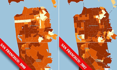
| maps of San Francisco showing median household income in 1990 and in 2012 |
This article says:
To illustrate the widening gap between the rich and poor in cities like San Francisco and New York, the Census Bureau has created map images that show the difference of income in respective cities from 1990 and 2012.
The light yellow indicates less that $35,000 while the dark brown indicates greater than $75,000.
I'm not sure if it shows "the widening gap between the rich and poor" as the median income appears to have increased in many areas. It also doesn't give a feel for the population density.
Note the yellowish horizontal strip on the upper left side of the left map. That pale yellow strip on the left map is Golden Gate Park and apparently it has become one of the wealthier areas of the city by 2012.
Checking the Census source one finds that the median household income for Golden Gate Park has risen from $0 in 1990, to $32,101 in 2000 and to $100,938 in 2012 (all in 2012 dollars).
Not bad for a park.
(I would bet the jobsworth census workers were assigned an area to canvas and interviewed whoever they found in it then it seems the park employees must be doing very well for themselves, especially if the sample included some of the city's homeless. That or some of the homeless are overly optimistic about the state of their finances)


No comments:
Post a Comment