 |
| page from The Essential Hieronymus Bosch |
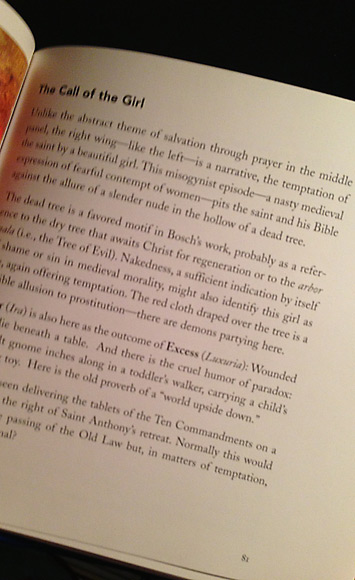
from the little book The Essential Hieronymus Bosch by W. John Campbell (2000) p81 about the painting the Temptations of Saint Anthony :
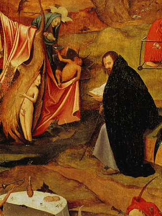
Unlike the abstract theme of salvation through prayer in the middle panel, the right wing – like the left – is a narrative, the temptation of the saint by a beautiful girl. This misogynist episode – a nasty medieval expression of fearful contempt of women – pits the saint and his Bible against the allure of a slender nude in the hollow of a dead tree.
 |
| the Temptations of Saint Anthony triptych (right panel) by Hieronymus Bosch. (A complaint about misogyny and no one mentioned the phallic shaped top of the building in the upper right?) |
 |
| click to embiggen detail of the Temptations of Saint Anthony (right panel) by Hieronymus Bosch |
So, Saint Anthony being tempted by a plate full of gold coins is a gold-hating episode and a nasty medieval expression of fearful contempt of gold.
Is it misogynistic to suggest that many men can be tempted by a naked woman? Is it misogynistic to reject the advances of a naked woman? Or is it that she is naked? It must not be the temptation itself or it would be "biblical contempt" and not medieval contempt. Or is it misogynistic that she appears not to have feet (because she is standing in water)? Is the man and woman on a flying fish misogynistic too?
She appears to be covering herself with a crab. If she is infested with gigantic genital crabs then most men would be less tempted by her.
She appears to be covering herself with a crab. If she is infested with gigantic genital crabs then most men would be less tempted by her.
If the author intends "misogynist episode" to refer to Saint Anthony's rejection of the woman then the author has it wrong as I think she was actually the devil in disguise. A mis-diabolus-ist episode!
 |
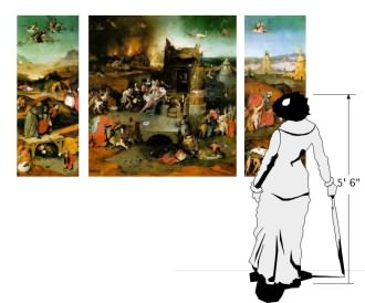
| an attempt to show the scale of the painting |
Essential Hieronymus Bosch book review : As an aside, I bought the book on impulse and blindly online and it wasn't exactly what I was hoping for. It is physically small (about 6" x 6") and parts of it are written in a style that, I think, is intended to sound like a high school girl. Oddly, this casual style isn't consistent. It is as if an editor circled a few paragraphs and said "Hey, punch this up a little and make it sound cool and youthful. Y'know, hep and groovy like the kids talk these days. And be sure to mention a popular TV show so the readers know that we know what's on TV. And call something misogynistic because the whippersnappers are always doing that."
It isn't a very deep book. Many of Bosch's paintings have a great many elements in them and while the book may take a stab at explaining a couple things it then moves on to the next painting. For example, the painting The Seven Deadly Sins illustrates the 7 deadly sins. There is an overview of the painting and about basically one line illuminating what is going on in most scenes. Like "Greed (Avaricia), as a judge taking a bribe (sitting on a bench, as in a modern court, he extends his palm behind him in a gesture called a 'porter's tip')" I would point out that the judge in the painting is literally sitting on a long bench with 2 other people while a modern judge sits on an elevated platform behind a large desk – which is called the bench for historical reasons. No mention of the other 2 men in the painting, the wood in the body of water or the peculiar tree behind the judge or if any of those elements are significant.
Some barely lend any insight at all to the painting like "Gluttony (Gula), a common problem in a world of feast or famine," or "Lust or Excess (Luxuria), as a party in a tent that recalls medieval book illustrations for romance of courtly love" while I think most people might want to know if that is a monk spanking a jester's bare bottom? The answer isn't found in this book.
The blurb on the otherwise sparse back cover (there is only "bosch" in large letters, the UPC and the blurb) says "'Be an art expert in 5 minutes.' – The New York Times". The actual headline is "MAKING BOOKS; Be an Art Expert In Five Minutes!" and may involve sarcasm. The article itself says things like "At their worst (and perhaps at their best, too) the books provide art education through one-liners, sometimes with an attitude that, if not snide, is flip and condescending." Also from the NYTimes article is this bit of snobbery "…the words may be embarrassingly rudimentary at times…" The problem is the lack of information not the lack of polysyllabic words.
It isn't a very deep book. Many of Bosch's paintings have a great many elements in them and while the book may take a stab at explaining a couple things it then moves on to the next painting. For example, the painting The Seven Deadly Sins illustrates the 7 deadly sins. There is an overview of the painting and about basically one line illuminating what is going on in most scenes. Like "Greed (Avaricia), as a judge taking a bribe (sitting on a bench, as in a modern court, he extends his palm behind him in a gesture called a 'porter's tip')" I would point out that the judge in the painting is literally sitting on a long bench with 2 other people while a modern judge sits on an elevated platform behind a large desk – which is called the bench for historical reasons. No mention of the other 2 men in the painting, the wood in the body of water or the peculiar tree behind the judge or if any of those elements are significant.
Some barely lend any insight at all to the painting like "Gluttony (Gula), a common problem in a world of feast or famine," or "Lust or Excess (Luxuria), as a party in a tent that recalls medieval book illustrations for romance of courtly love" while I think most people might want to know if that is a monk spanking a jester's bare bottom? The answer isn't found in this book.
 |
| Hieronymus Bosch's Seven Deadly Sins detail of Lust "medieval book illustrations for romance of courtly love" = a man in robes spanking a man dressed like a rabbit? |
The blurb on the otherwise sparse back cover (there is only "bosch" in large letters, the UPC and the blurb) says "'Be an art expert in 5 minutes.' – The New York Times". The actual headline is "MAKING BOOKS; Be an Art Expert In Five Minutes!" and may involve sarcasm. The article itself says things like "At their worst (and perhaps at their best, too) the books provide art education through one-liners, sometimes with an attitude that, if not snide, is flip and condescending." Also from the NYTimes article is this bit of snobbery "…the words may be embarrassingly rudimentary at times…" The problem is the lack of information not the lack of polysyllabic words.


No comments:
Post a Comment